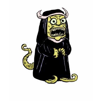
I'm in a big hurry tonight, so although this week's "Doodle Penance" derives from a search for "manga fleas," I've taken a bit of a shortcut. Figuring that Mike would also be drawing at least one Manga Flea, I have only drawn one Manga Flea myself.
I really don't like drawing in a manga style, and I am not even going to pretend that this is an approximation of any real manga styles. It's really not my bag. Also, I am not much of a caricaturist, so I can't make any claims that this looks like the original.
Mike, I leave it to you to to display and explain your own doodle, per our usual practice.
—Isaac, that could be manga, maybe: it's got huge eyes, spiky hair, and Hello Kittys stuck all over it. It's manga enough.
Me, I decided to go with the bloodsucking variety of flea (though yon bass player showed up on the Google Image search along with the parasite, unsurprisingly). Here's my manga flea:
I had had grandiose ideas about drawing a whole slew of manga fleas in a variety of styles, since I own manga from such diverse artists as Osamu Tezuka, Goseki Kojima, Hajime Ueda, Keiji Nakazawa, and others, but since Isaac told me he had tossed out his doodle really quickly I figured why bother. Now I see that his quick doodle is a lot more elaborate than mine. But mine is at least based on an image from a genuine manga-ka, the great Rumiko Takahashi, because this is the image I flipped to at random when I opened the first book from my big stack of manga, a Japanese original of volume 34 of Urusei Yatsura:
So okay. There's a little genuine manga drawing for you. And since Lum there (cowering in the lower left-hand corner) has cat ears, maybe she has reason to watch out for manga fleas. Mrrrow.
Here you will find information on comics produced by Isaac Cates and Mike Wenthe, with more general comment on comics & collaboration; recommended reading; and sundry matters pertaining to the craft & criticism of comics. Particular attention will be paid to the two series Satisfactory Comics and Elm City Jams.
Sunday, May 31, 2009
Thursday, May 28, 2009
A Link to Click
Nothing major to report, but here's my review of Beth Ann Fennelly's most recent book, Unmentionables. It's a good book. If the review gets you interested, here's a link to a place where you can buy the book itself.
Designing an Unpleasant Character: Charles
Over the weekend, when I was working out a design for the "Charles" t-shirts, my first sketch wasn't as good as I wanted it to be. I didn't realize it until I'd inked Charles, but he looked a little too genial, not quite so repellent, as the original Charles whose body language and "default facial expression" made our narrator so uneasy.
Here's my original sketch.
He looks like a pretty homely fellow, but not totally unpleasant. You could imagine that once you got to know him, he'd even be fun to go get pizza and beer with. After a little consultation with a reader, I was able to come up with a second version.
I think you'll agree that this second version seems a lot less pleasant. You'd hardly even want to follow this guy into an elevator. Over the past few days, as I open my notebook, I've been really curious about what makes for this version of Charles seem so much nastier (and truer to the original concept). The basic design is essentially the same, except for the addition of nostrils, and the facial expression isn't very different either.
Setting them side-by-side, I think the clearest difference that emerges is how he's holding his mouth. After that, though, is a subtle matter of his face's shape. The second Charles's face bulges lower than his cheeks. He's jowly. This seems to imply that his face has settled into that expression over years of smirking. The first Charles looks ten years younger, and his higher cheeks suggest that he might smile under different circumstances. (In fact, he looks more like he's smiling.)
Overlapping the two images brings out a few other contrasts:
1. Second Charles (in green) has different body language: his shoulders are much more hunched up, or he's slouching more. Again, that connotes more gravity or more resignation.
2. Second Charles is less symmetrical. His hair is lumpy and off-center; his mouth is held over to one side.
3. Second Charles's eyes are smaller and closer together.
4. The gap between eye and eyebrow is greater on Second Charles, so his facial expression is more extreme. There's no chance that he's playing around here: that's real scorn, slight regard, and contempt.
There was really no question which of these two deserved to be colored and presented on merchandise. Here's to constructive criticism and revision!
Tuesday, May 26, 2009
...and what She found there by Cee-Cee Swalling
Unlike Isaac, I have never taught a course in comics-making, though I have occasionally included comics projects as an option within a creative-writing unit in more general literature classes. Well, I gotta kvell: a student who produced a short autobiographical piece for my introductory literature course back in fall 2006 recently completed her BA in Literature with a creative-writing senior capstone thesis, and her medium was the minicomic. So here are a few panels from ...and what She found there, the debut work in comics of Cee-Cee Swalling.
At first, Cee-Cee had thought about adapting Alice in Wonderland into comics. Cee-Cee was in my comics class back in fall 2007 when guest speaker Paul Karasik gave a terrific lecture on various literary adaptations into comics, which included some discussion of the classic MAD adaptation/parody of Alice, and I know Cee-Cee had explored some other prior comics adaptations of Alice as well. Ultimately, though, she chose a different tack: autobiographical material filtered through the language and images of Lewis Carroll's two Alice books.
The current edition of ...and what She found there includes four stories, three of which are based on episodes from Cee-Cee's life, from childhood to summer 2008, and a fourth of which abandons autobio but keeps the conceit of using Carroll's work to reflect contemporary American concerns. Her adaptive methods vary from story to story. Thus, the opening story uses the exact language of the poem of Tweedle Dum and Tweedle Dee to narrate a scene from Cee-Cee's childhood squabbles with her little brother:
The story takes a surprising but effective turn with the sudden arrival of the "monstrous crow" from the poem, which takes on a very different form in the comic as the symbol of a family health crisis. The new context that Cee-Cee brings to the poem adds a surprising depth to it without dismantling the poem's playful tale of youthful quarreling.
The second story, adapting the great poem "Jabberwocky," is not drawn directly from Cee-Cee's life. Instead, it adapts the poem by splitting its text between two parallel timeframes: a quasi-medieval portrayal of a young knight who confronts the literal Jabberwock monster alongside a contemporary depiction of a College Democrat who casts a vote against the metaphorical Jabberwock of the McCain-Palin ticket. Here's the big battle scene in the voting booth and in the tulgey wood:
(There's a full-body portrait of the Jabberwock on the previous page of this story.)
The fourth and final story, "Off with her head!", offers still a third kind of adaptation—more of a riff on a theme than a direct translation of Carroll's plots or language. Here, Cee-Cee examines how both she and her mother seemed at times to exemplify the behaviors of the imperious queen of Carroll's books, even as Cee-Cee herself sought release in the fantasy worlds of reading and the imagination. She writes in her own voice, though with numerous visual echoes of the Alice books. Her method in this story seems closer to that of Alison Bechdel in Fun Home: allusive, intertextual, and reflective about the role of reading and referentiality in coming to understand oneself:
All in all, I think it's work that Cee-Cee should be proud of, and I am proud to have followed this project from its earliest stages. She's still expanding it, I'm told, and with any luck she'll have copies to hawk from a corner of the Satisfactory Comics table at MoCCA in a couple weeks' time. In the meantime, or if you can't make it to MoCCA, by all means visit her blog at ceecendesist.blogspot.com, where you can read the first versions of several of these stories and some other comics work, as well.
Monday, May 25, 2009
Doodle Penance Postscript: More than one way to skin a rat
In yesterday's Doodle Penance, I noted that would-be imitators of Chris Ware's cartoon wolf might need to scalp a famous cartoon rodent. I did not name that rodent, but I thought it might be interesting to note some other cartoon rodents, questionably famous, that bear a resemblance to my example.
First, there is the astonishing appearance of these giant rats in Osamu Tezuka's early manga Metropolis (inspiration for the 2001 anime):
They're monstrous, all right, but no mistaking their ultimate source, as their scientific name reveals:
Chances are that Tezuka's work here was itself an unrecognized source of inspiration for me in my doodle, given the fate of the giant rat in these panels:
There's even a final panel where the head dangles ready for further scalping:
It's a pretty remarkable ripoff of M.M., but perhaps less so than Foxy, the animated character from the first Merrie Melodies cartoons who resembles M.M. in almost every detail apart from the bushiness of his tail and the pointy tips on his round ears. If you haven't yet laid eyes on Foxy, you should really click on that link. Seeing is believing, though it's hard to believe that Disney was able to tolerate the rival character.
My last example of a seemingly-scalped cartoon rodent is good old Mickey Death, the skull-headed curmudgeon whose adventures were chronicled by Eric Knisley and Kevin Dixon.* I first encountered Mickey Death in a free paper I picked up somewhere in the Triangle (either Durham, N.C., or Chapel Hill, I forget which) back in the early '90s. You can read about M.D.'s exploits here, or try to snag a print copy of the collection Mickey Death and the Winds of Impotence from lulu.com here (it's cheap as free)—or perhaps you could do as I did and buy a copy direct from co-creator Eric Knisley, should you be lucky enough to find him at a con.
*Click here for a Boing-Boing roundup of images of skull-headed Mickey clones, where a nice drawing of Mickey Death is the second of eight such images (so far).
Sunday, May 24, 2009
Doodle Penance: "how to draw ware wolf"
This week's "Doodle Penance" is the product of a search for a fairly simple bit of information: "How to draw ware wolf."
I think I know what this Googler was looking for, and as usual I'm surprised we haven't talked about it yet. I mean, Doodle Penance has featured information about lycanthropy before, but we've never mentioned the most important connection between contemporary cartooning and the children of the night.
I refer, of course, to the fact that Chris Ware, author of ACME Novelty Library among other fine cartoon publications, undergoes an eerie transformation under the light of the full moon. Here's a little bit from his sketchbooks that describes the process:
I bet you didn't realize that several panels in "The Graveyard of Forking Paths" were swiped from Chris Ware, did you?
Mike? What have you got this week?
—Well, it so happens that Chris Ware has already drawn a wolf in his characteristic circular style, as seen in his Fairy Tale Road Rage contribution to Little Lit (click here to see it), so I thought I'd simply show how to draw that. That Ware wolf looks more or less like this:
Now, you can tell at a glance that most of this image is easily reproduced using the Ed Emberley inventory method. Almost every element can be found among the simple shapes below:
From left to right, that gives you the basic shape of the skull; the oval nose with its small circular highlight; the "therefore" symbol (three dots) for the wolf whiskers; the squashed C (or "Pogo nose") for the snout; the medium circle for the eye; and the leafless black tulip for the pupil.
However, these simple shapes will not suffice for the most complicated part of the Ware wolf: the black cap of the fur, ears, and cheek. Frankly, that shape is too hard to draw unless you are actually Chris Ware himself. Fortunately, there is a work-around. Simply capture a famous cartoon rodent and scalp him, then pluck off the ears to leave the roots of the ears to serve as convenient wolfish tufts, thus:
You can simply discard the remainder of the rodent in a convenient receptacle:
This method works well to provide the necessary impossible-to-draw shape, but it has its own "drawbacks" (if you'll, heh heh, pardon the pun!). As with any tissue graft, there is the risk of rejection by the host, so you'll need to administer a strict regimen of immunosuppressant drugs to avoid afflicting your drawing with the hellish outcome of a scalp-rejection:
And that's how to draw Ware wolf!
T-Shirts with Charles (the "Silent Critic")
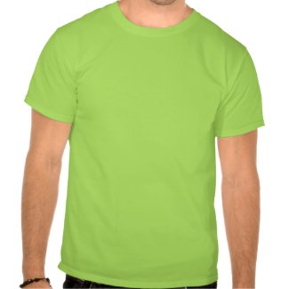
These are the last t-shirts I intend to design this weekend. I've received a couple of requests for a shirt featuring Charles, who appears in Tales from the Classroom, in the story "The Silent Critic." You can read that story in its entirety if you follow the link there.
Here are a couple of classic Charles utterances, which I think you'll agree are worthy to adorn your torso:
This shirt is temporarily offline, until I jigger a couple of things in its design.
"I really admire your facility with administrative processes," he says.
Also, the more multi-purpose backhanded compliment, "I can see that you put a lot of effort into some of this." That's about the best he can muster.
Enjoy the shirts, wear them in good health, and please let me know if you have any other requests.
Friday, May 22, 2009
New T-Shirt Designs; T-Shirt Sale
It looks like Zazzle is having a Memorial Day weekend sale. All their t-shirts are 10% off.
In honor of the sale, I've designed a couple of other t-shirts, and I'll try to bring another couple online before the end of the weekend.
Again, these are available in lots of sizes and colors.
When you check out, you have to type MEMORIALSALE in the space for a discount / sale code.
Don't worry, not every post this month will be about the way we're selling out. But I figure as long as we're going to have a Zazzle store, it might as well have a few different things in it.
Thursday, May 21, 2009
Our Contribution to "Covered"
If you're clicking over to our blog from the "Covered" project, I hope you'll stick around to check out our big summer back-issue sale and maybe some of our ridiculous "Doodle Penance" posts.
(And if you haven't heard of "Covered," I highly recommend it as a cool place to see people manipulating and laying claim to the powerful imagery of other people's comics covers.)
You might be curious to know how we chose our contribution, and why our image looks so little like the original Walt Simonson cover for Batman #366. We actually worked up two submissions for "Covered," and the one they ran was our version of the cover of the first comic book Mike ever bought.
The way we did these was typically peculiar and unnecessarily difficult.
The main thing is that each of us was, sort of like Pierre Menard, duplicating an image he had never really seen. First, we both picked covers that the other guy hadn't seen. Mike drew a set of pencils from the original cover of Batman #366...
(All of the images in this post will enlarge if you click on them.)
... and I then inked his pencils without consulting the original image:
... and then, still without consulting the original, I colored my version digitally:
I was trying to stick pretty close to the flat colors of the Superfriends cartoon there. I wanted to stay pretty cartoony in my inks as well, figuring that would be a good way to "own" the image and make it look more like our work than the original.
Have a look at the original, by comparison:
Simonson's image has a little more kinetic energy in it—a subtle change in the position of Batman's right leg makes a lot of difference in the balance of his figure, I think—and my Joker is a little bit chunky. And of course I didn't quite figure out the light and shadow on that weird building. But I think our version gains in legibility what it loses in energy.
(Mike would like me to point out, here, that the cover of Batman #366 is unique in the many-decades-long run of Batman in having a never-repeated logo for the book's title, integrated into the drawing almost in the manner of one of Will Eisner's Spirit titles. Mike has also heard that this cover existed before the story it illustrates—that the drawing by Walt Simonson was so cool that the editor ordered a story created to back it up.)
Our other cover-of-a-cover, which you'll see only here on the blog, started with drawings of Jack Kirby's Forever People #6. That's not the first comic I ever owned—my childhood copy was part of a big pile of Fourth-World comics given to me by one of my dad's friends when I was about six years old. But out of that Kirby-at-DC stash that had such a powerful effect on me as a kid, I thought this one had one of the coolest covers.
I started with a quick thumbnail, to see whether the image would work in my simplified style:
Then I did a set of pencils in my notebook and sent them over to Mike, who had never seen the original image:
(Already I am losing some of the energy and drama in the thumbnail.)
Then Mike did an admirable job inking my simple scribbles:
... and then he put some colors on them:
What's strange—and I still can't really believe we can say this—is that the original Jack Kirby cover of Forever People #6 seems more subdued.
I'm not sure how successful either of these "covers" is—I mean, I don't think either of us should consider quitting his day job in an effort to unseat James Jean or whoever—but I have to say it was a ton of fun to put some time and effort into aping Simonson and Kirby. I won't say it has been a long time since I last copied drawings by Kirby, but this is probably the most careful I've been about it, and as an exercise I certainly recommend it.
Wednesday, May 20, 2009
SUMMER BACK ISSUE SALE
We've been getting a fair amount of traffic lately, and in order to make some room in my closet I've decided to offer a big silly sale on back issues of our minicomics.
Here's the deal: with a few exceptions,* and as long as they remain in stock, you can have any three issues of our minicomics for just $5.00, postpaid. This is a pretty big bargain. It's actually a little below cost for me in almost every configuration. But the comics will make me happier in your hands than in my closet, so please don't worry about the small cost to me.
(*I can't include the elaborate Satisfactory Comics #6 or the Mapjam in the sale because the stock of those comics is so low and I know I'm never going to reprint them, but I'm still willing to sell them at regular price or as part of the "Complete Package" deal if you want to go all out.)
Feel free to browse through the selection of back issues over in the sidebar, or consider some of the three-issue value packs I describe below. I don't think you'll be disappointed, and you won't be able to get these comics cheaper anywhere. (I'm not going to bring most of the back issues to MoCCA this year.) Click on this button (or the one at the bottom of the post) and let me know which issues (or which "value pack") you want, and I'll get them in the mail to you speedily.
If you'd just like a sample of our best work, you can't go wrong with the issues in the Story Sale Pack. These three issues have some of our best writing, and some of our most satisfying world-building work.
If you've got a small comics-reader in your life, we commend the Kids' Sale Pack to you. Every issue of Satisfactory Comics is kid-safe (though that's not true for Elm City Jams), but these three stories are particularly good for kids — they're the ones we hand to parents who pass our table at MoCCA.
If you want to see how we do jam comics, order all three issues of Elm City Jams in the Jam Sale Pack, and get a free copy of our Treatise Upon the Jam as a bonus.
If you just want to see how bizarre our imaginations can get, try the Crazy Sale Pack: there's some weirdness in these issues that will put any week's Doodle Penance to shame.
If you like comics but aren't too sure about me and Mike, try our Guests Sale Pack. In those issues, you'll see contributions from people ranging from Jon Lewis to Scott C., from Tom Hart to Bishakh Som, from Tom Neely to Lark Pien, from Sam Henderson to Joey Sayers. Seriously: we've been lucky enough to work alongside a real cavalcade of minicomics stars.
Update: Desert Island Paradise is no longer in stock, so I guess this particular sale pack is a no go. But look at the other goodies you can get:
If you're a fan of Matt Madden, or if you came here from Derik Badman's site, you might want to check out our Constraints Sale Pack, in which we find dozens upon dozens of ways to make comics more difficult for ourselves.
If you're Scott McCloud, you might want to try our 24-Hour Comics Sale Pack, in which we try on three separate occasions to finish a comic in a single day. Did we make it? $5.00 gets you an answer.
If you came here from the Got Medieval blog, you might like the Medieval Sale Pack, which features a faux-Medieval fantasy setting, a Middle-English alphabet poem, and the Death Song of the Venerable Bede.
You can also put your own value pack together. Just name the three comics you want, and if I've still got 'em, they'll be on their way. If you want more than three comics, just send me an email (isaac dot cates at aya dot yale dot edu will ring me up) to work out a deal.
Three comics for five bucks, postpaid. I think you'll agree it's a good value.
Please note: although this post is more than a year old, I will still honor these prices. I'm happy to get comics into your hands and out of my storage space.
Here's the deal: with a few exceptions,* and as long as they remain in stock, you can have any three issues of our minicomics for just $5.00, postpaid. This is a pretty big bargain. It's actually a little below cost for me in almost every configuration. But the comics will make me happier in your hands than in my closet, so please don't worry about the small cost to me.
(*I can't include the elaborate Satisfactory Comics #6 or the Mapjam in the sale because the stock of those comics is so low and I know I'm never going to reprint them, but I'm still willing to sell them at regular price or as part of the "Complete Package" deal if you want to go all out.)
Feel free to browse through the selection of back issues over in the sidebar, or consider some of the three-issue value packs I describe below. I don't think you'll be disappointed, and you won't be able to get these comics cheaper anywhere. (I'm not going to bring most of the back issues to MoCCA this year.) Click on this button (or the one at the bottom of the post) and let me know which issues (or which "value pack") you want, and I'll get them in the mail to you speedily.
If you'd just like a sample of our best work, you can't go wrong with the issues in the Story Sale Pack. These three issues have some of our best writing, and some of our most satisfying world-building work.
If you've got a small comics-reader in your life, we commend the Kids' Sale Pack to you. Every issue of Satisfactory Comics is kid-safe (though that's not true for Elm City Jams), but these three stories are particularly good for kids — they're the ones we hand to parents who pass our table at MoCCA.
If you want to see how we do jam comics, order all three issues of Elm City Jams in the Jam Sale Pack, and get a free copy of our Treatise Upon the Jam as a bonus.
If you just want to see how bizarre our imaginations can get, try the Crazy Sale Pack: there's some weirdness in these issues that will put any week's Doodle Penance to shame.
Update: Desert Island Paradise is no longer in stock, so I guess this particular sale pack is a no go. But look at the other goodies you can get:
If you're a fan of Matt Madden, or if you came here from Derik Badman's site, you might want to check out our Constraints Sale Pack, in which we find dozens upon dozens of ways to make comics more difficult for ourselves.
If you're Scott McCloud, you might want to try our 24-Hour Comics Sale Pack, in which we try on three separate occasions to finish a comic in a single day. Did we make it? $5.00 gets you an answer.
If you came here from the Got Medieval blog, you might like the Medieval Sale Pack, which features a faux-Medieval fantasy setting, a Middle-English alphabet poem, and the Death Song of the Venerable Bede.
You can also put your own value pack together. Just name the three comics you want, and if I've still got 'em, they'll be on their way. If you want more than three comics, just send me an email (isaac dot cates at aya dot yale dot edu will ring me up) to work out a deal.
Three comics for five bucks, postpaid. I think you'll agree it's a good value.
Please note: although this post is more than a year old, I will still honor these prices. I'm happy to get comics into your hands and out of my storage space.
Sunday, May 17, 2009
Doodle Penance: "satisfactoy comics"
This week's "Doodle Penance" comes, straightforwardly enough, from a Google search for "Satisfactoy Comics."
As soon as I read this, I realized Mike and I had been remiss: we've never even mentioned our plans (still not completed, like so many of our other plans) to dramatize the complete Satisfactory Comics corpus with LEGO minifigs. Of course we went with the punnish title. That must have been Mike's idea.
Here's the first part of the first panel of Satisfactoy Comics #1.
Fortunately, I guess, before we went through with this plan, we realized we'd been scooped by The Brick Testament.
Mike, what have you got this week?
—Well, Isaac, I'll show you. First, though, I like where you went with Satisfactoy Comics, there. And I'll admit that my first thoughts considered possible toy-related adaptations of our comics, in line with Peter S. Conrad's Rubik's cube comic or the aleatory comics printed on dice that were discussed in a volume of OuPus, the journal of the Ouvroir de bande dessinĂ©e potentielle. But I decided to follow a different inspiration. Namely: what would our comics look like if they were missing their R's?
Since we've entered that time of year when it's inadvisable to eat oysters, I thought I should consider Satisfactory Comics #3 for its adventure partly set at sea, where oysters are harvested. The main character of that tale, insofar as there is one, is Herman the Harpooneer. But take away the R's and he becomes...
Time allowing, I would have loved to show his foe, the gigantic Kaken, but time does not allow. Still, I think it fitting that the R-less version of issue 3 should have a sort of toy tie-in after all...