Monday, January 30, 2012

Alphabeasts: P is for Pushmi-Pullyu

This week's entry in the "Alphabeasts" project gave me a little trouble, because it's such a strange creature that I kind of couldn't figure out how it works. As it is, I wound up departing from my available models considerably.

Friends, I give you the pushmi-pullyu.


I know what you're thinking. "I've seen that movie, Isaac, and the pushmi-pullyu is more like a llama thing than a gazelle thing. It doesn't have horns. It likes to dance. I've never seen anything like it, but your drawing isn't much like it, either."

But believe me when I say this has more fidelity to the original than what you'll see in the Rex Harrison movie (or the Eddie Murphy one). In Hugh Lofting's original The Story of Doctor Dolittle; Being the History of His Peculiar Life at Home and His Astonishing Adventures in Foreign Parts (1920), the pushmi-pullyu is an African animal (and that alone quashes any llama/alpaca/vicuña/guanaco theory) descended from "the Abyssinian gazelles and the Asiatic chamois" on one side and "the last of the Unicorns" on the other.


In fact, the author himself illustrated the first editions of the book (which you can now see for yourself, thanks to Google), and his pushmi-pullyu definitely has horns.


It also seems to have only one eye on each side of its head.


So, rather than the cordial double-llama, Lofting gives us a rubbery chimera, a sort of combination of the cyclops, the amphisbaena, and the unicorn, with a dash of gazelle and platypus thrown in. Egad. It wasn't an easy creature to draw. I had a few false starts.


I figured out quickly enough that I didn't want to make the posture symmetrical, though I suppose I could have saved myself some drawing if I'd done that. I also thought, for a while, that I might swipe my own drawing of the gerenuk from the Animal Alphabet, but those results weren't great.


This looks like a regular gazelle trying to fool hadpanagus by putting a papier-mâché horsey head on its rump. So, so lame.

I include that image only to chastise my own drawing hand, to remind myself that although I am getting better I am still not a very natural cartoonist. Please, pass it by.

Next week is the letter Q. I'll have to use one of my aces in the hole.

Saturday, January 28, 2012

DAMN! Now, that is a STAMP!

Somehow the postal rate increase took me by surprise, so I am not ready with enough small-denomination stamps or whatever. I just spent an hour or more trying to order the right stuff on the USPS website (which is a miracle of clumsy web design).

But on the plus side, check out this year's Lunar New Year stamp.


It's enough to make you want to send mail, I tell you.

Monday, January 23, 2012

Alphabeasts: O is for Oskie Bugs

I am not sure how obscure this week's Alphabeasts critter is, though I've had a really hard time finding information about it online. I thought that Yo Gabba Gabba! was a thing these days, but maybe my impression of it is distorted by the fact that I read Evan Dorkin's blog (he is an occasional contributor to the show) or by the usefulness of the program in holding the attention of very small children.

But maybe if you're a fan of Yo Gabba Gabba!, or if you've got a wee one in the house, you will have heard of the oskie bugs.


Like Gooble, the oskie bugs are denizens of Gabbaland that appear infrequently but are treated more or less as known quantities by the show's main characters. I gather that there's an episode in the third season in which the main characters shrink down to follow the oskie bugs into their tunnels, but I'm basing my drawing here on the oskie bugs I'm familiar with. (I have only seen the episodes I can stream on Netflix, but I have seen those many times now.)

In episode 7 of the first season, "Friends," at about five minutes into the program, Toodee and Plex (the magic robot) are waiting quietly in Toodeeland to see whether the oskie bugs will come out. (One of the things I like about them: the oskie bugs will only come out if everyone is quiet. I plan to make use of that fact in the future.)


When they do come out and march across the screen, Toodee is so psyched that she wants to give Plex a high five about it; this leads to a song in which she explains what a high five is, and what it signifies. I've found a couple of badly recorded clips of the song, but none that starts early enough that you can see the oskie bugs. (That's why I snagged the screencap above.)

If you'd like to see someone "re-enacting" the scene with dolls, that's up to you.

Next week: I think my next Alphabeast had a cameo in an Eddie Murphy movie.

Monday, January 16, 2012

Alphabeasts: N is for Nerd

As you may know, I am letting myself have only one Alphabeasts creature per universe or creator. This week's critter was therefore in some ways a difficult choice, because one could practically draw a full alphabet populated only by Dr. Seuss's figments and oddments and homunculi. (I don't know whether he ever invented a critter that starts with an X, though.)

And yet, how could I resist the original nerd?


I slipped in a few nice nerd gags there. Click to enlarge and read, but don't give yourself any bonus points if you use google to "get" the references.

I'm not wild about my drawing—I seem to have as much trouble with Seuss as with Mercer Mayer, and I definitely got the head-to-body proportions wrong—but I suppose the little japes are fun.

Anyway: believe it or not, Dr. Seuss really may have added the word nerd to the lexicon. Have a look at what the OED, the ultimate etymological authority, has to say about it:


There's only one drawing of the nerd in If I Ran the Zoo, and it's one of three critters on the page (along with the nerkle and the seersucker). But in case you are curious what the original looked like, I have scanned it for you.


Next week: little critters you might have heard of if you have a little kid in the house.

Monday, January 9, 2012

Alphabeasts: M is for Mugato

This week's Alphabeasts creature is dear to my heart despite of — nay, perhaps because of — its intense dorkiness. It's not just a guy in a white gorilla suit. No, this is gorilla suit with a few horns and a tail stuck on!


This must be the week for goofy alphabeasts!

Maybe you're not familiar with the mugato. This video clip will tell you all ye need to know.


Maybe you would prefer the sort of cartoon that isolates a creature from its natural environment, without that mysterious grainy background. (And if you're the first to tell me, in the comments below, where I got that background, then I'll happily send you a couple of alphabet minicomics for free.)

If you want to see its feet, in other words, or if you just want it bigger, here's a picture from my working files.


It took me a while to work out a pose that would allow me to show off the mugato's goony face and the row of ridiculous dinosaur-style spikes that run down its back. Here are some of my notes, on the back of an envelope.


Next week: another possibly apocryphal mid-century etymological surprise.

Wednesday, January 4, 2012

Makeshift Speedy Lettering Method

I haven't mentioned this here on the blog, but I just finished writing the introduction for my friend Sarah Becan's graphic novel Shuteye, which collects several years of her minicomic series by the same name. Shuteye got funded recently on Kickstarter, and I'm really excited to see the final product. It's going to be a nice-looking book.


I was really flattered when Sarah asked me to write the introduction, and as I thought about it (and about the look of the book), I decided that I would offer to letter the introduction by hand. I think it'll fit in better with the rest of the work that way, and Sarah seemed genuinely happy that I had offered to do the little bit of extra labor.

I had also been yearning to do a little lettering. I have to admit, though, that this work didn't quite wind up scratching that itch, because I had to do the final work in a sort of hasty way.

Because I figure someone might someday want a method for hand-lettering a large chunk of text that is speedy but gives competent results—like, I am not going to be embarrassed for Sarah to publish what I wound up with—let me tell you what I did.

1.) Okay, first I had to write the text. And because I do that in a word-processing program, I had a file I could work with. I set the text in small caps (which you can do as an option in Word with control-D), and chose a font that seemed to have spacing and proportions sort of like my all-caps lettering hand. I set the dimensions of the page to correspond with the pages in Sarah's finished book.


2.) I printed it, and through a process of tinkering I got it to print at a size I liked. After a botched first attempt I realized I needed to print it at about 80% size, because full-size 13-point Century looked good in the space available but felt unnatural when I tried step three.

3.) I got out the lightbox and another sheet of paper and "traced" the text I had printed. I wasn't actually tracing it. I have done that before, for different sorts of projects, but in this case I was just using the spacing of the rows as a guide, and the image shining through the lightbox as a reminder of the script I had written. I even altered the text on the fly once or twice.


It's worth noting that, at this stage, I could have opted to do the work much more neatly, but I didn't want my finished product to look like I'd been tracing something.

4.) Because I was lettering pretty fast, I wound up making a few mistakes. I knew I was going to be putting everything through Photoshop in a couple of steps, I figured I'd just write corrected versions of the same words off in the margins, where I could easily cut and paste them into place.


A couple of times it took me more than one try to get a simple word right.


(This second version shows the brightness / contrast adjustments that came during the Photoshop work.)

To do this lettering, I just grabbed the nearest pen to hand, which was my slightly damaged daily-use Rapidograph. Probably this is a weird practice, but I have a ".50" Rapidograph that I keep around for writing postcards and other stuff when I want a nice dark ink. Sometimes I use it for doodling. I really shouldn't use it for finished work, though, because the little needle inside the nib is slightly bent, and that makes it leave like a little "tail" as it approaches the page from some angles.

You can especially see the problem when I write the letter E.


I wound up having to erase each of those things individually in Photoshop; I could have saved myself a lot of work if I'd had a better Rapidograph inked up and ready to use. Anyway, on to the last "step."

5.) I scanned both pages of text, adjusted brightness and contrast, and cleaned things up. That could have taken less time than it did.

The end result: definitely hand-lettered, a little sloppy, but with good straight lines underlying the sloppiness. Lots of imperfection, which means character, and that's more or less what I was shooting when I offered to hand-letter it in the first place.


I didn't have to use an Ames guide at all, even though I was dealing with big blocks of text. I just used typing paper and a pen near at hand. And I think it still looks better than the lettering in Britten & Brulightly.

I'll print the full text of my introduction here on the blog when Shuteye is available for sale.

Tuesday, January 3, 2012

More AZ Fanart: Antiosour vs. Bonosour

Maybe you thought that hadpanagus and ichipotomas were enough for me. Nope! I like all of AZ's animal creations. I might even manage to catch up with her Alphabeasts alphabet if I do more than one a week.

And so I present you with antiosour and bonosour, who are natural enemies.


Originally, AZ posted these two creatures with no notes, so I had to try to figure out what I could about them just from the drawings.


My first thought was that the circles over their heads might be a sort of organic, permanently attached speech balloon or thought bubble.


Or, I thought, since bonosour seemed to be a bird, maybe they were ornamental feathers. But, as it turns out, such is not the case. Here's what AZ has to say about antiosour:

He is a crazy bad guy. He doesn’t do anything but sit around looking mad. He can’t even really move around. He tries to take over the world by sitting on a stool and electrocuting people with his antenna, which can send signals through electrical wires.


And as for bonosour? Well, his cranial appendage is an antenna, too:


AZ says, “Bonosour is a birdie. He never gets electrified because the electric in his antenna goes back to Antiosour’s antenna.” So, Bonosour is immune to Antiosour attacks, because he absorbs Antiosour’s electricity and shoots it back. Bonosour does not like Antiosour, because he is a good guy. But, curiously, he does not use his powers to save people; he only uses them to protect himself.


With that information in hand, I was able to work up this doodle or thumbnail.


And then it took me a couple of weeks to produce the finished art. Maybe I'll get my next drawing done more quickly. There are plenty of awesome AZ creatures where these came from!

Monday, January 2, 2012

Alphabeasts: L is for Landstrider

This week's Alphabeasts drawing is from a movie I never saw when it was actually in theaters, though I probably would have enjoyed it more then. To tell you the truth, The Dark Crystal in late 2011 left me flat.

All the same, here's a landstrider:


When I was assembling my plan for this alphabet, I used a wikipedia page that lists the various fauna of Thra, figuring that with Jim Henson behind it That Dark Crystal would at least offer me some interesting stuff to draw.

And I'll admit that there's a lot of visual imagination in the landstrider. I described it to Sam Wolk a few days ago as having a walrus/catfish/sloth face, a giraffe/elephant body, and the movements of a guy-on-stilts crossed with a guy-on-all-fours. The landstrider does not look like a natural thing, especially when it is in motion. Because it is a guy on stilts and on all fours at once. I think the area they come from, on Thra, is called the Uncanny Valley.

I'm sure if I'd watched the movie when I was ten, the next few weeks would have seen my spiral notebooks filling up with doodles of skeksis and mystics, garthim and nebries. (Frankly, I'm surprised there weren't more garthim drawn when the Alphabeasts were covering G.)

But between the all-too-transparent archetypal/stereotypical quest narrative (obviously destined to succeed, despite the protagonist's lack of agency. resources, or personality) and the gelfling puppet performances that kept making me think of Team America: World Police, I couldn't manage to care about the characters in the movie or their goals.

I found a lot of the incidental detail (the flora, the geology) really charming, and some of the puppet/costumes really impressive, but I can't say I'd want to watch them again.

Give me a couple episodes of The Muppet Show instead—and kudos to the clever soul who drew koozebanians last week.

Next week: an unexpected unicorn!

My Panelists Archive: On Adventures in Cartooning, for First Second's Fifth

My final post for the now-defunct Panelists blog was for our series celebrating the fifth anniversary of First Second Books. Before I get to it, let me say that I am genuinely sad that I couldn't contribute more to The Panelists while it was alive. My paying work has made it impossible for me to write much at all lately, and although I had (and have!) ideas for short essays I wanted to write, I never got to them.

The thing that I liked best about The Panelists was the real feeling of camaraderie, of shared purpose, even among scholars and critics whose tastes don't perfectly agree. Probably if you placed all the comics in the world on the table between the six of us, there would be not a single book that we would all want to take home for the top shelf of our personal canon. Things that got Charles and me fired up would leave Derik cold. The Venn diagram of our tastes would be hard to draw. But we worked well as a team, making a whole that, when it was functioning, was greater than the sum of its parts.

Early in the team's history, my image for our collected powers was of a great Voltron of comics criticism. The sad thing was to watch that Voltron try to march into battle with both its legs and one arm totally asleep. (In this image, I would be one of the useless legs.)

I'll miss the Panelists, more for its potential than for its actuality; more for what it represented to me than for what it managed to become.

Our comics culture needs more places for careful and sustained snark-free criticism, where every claim is supported with thoughtful evidence and every quibble is launched in the spirit of arriving together at a better understanding of the medium's inner workings.

Anyway, here's the last squib I managed to scribble.


The first time I taught a course on making comics, the closest thing I had to a textbook or instruction guide for the students was Scott McCloud’s then-new Making Comics. I wound up using parts of the book, skipping other parts, and generally wishing I had something that I could use all the way through the semester.

Thanks to First Second, I now have a serious alternative, in Jessica Abel and Matt Madden’s Drawing Words & Writing Pictures. Organized around lessons and exercises, DWWP moves through a series of skills that build incrementally: composition and drawing basics are followed by more elaborate lessons and work on progressively larger units, from the panel to the strip, from the story to the zine. If I find myself teaching another class on making comics, I’m sure I’ll assign it. In fact, there are patient explanations of the use of things like Pro-White and the Ames Guide in DWWP that I should probably re-examine if I ever make comics seriously again myself: there’s a lot I could learn from this book.

For the moment, however, I want to consider the benefits of a competing textbook, also published by First Second. This other book covers less ground and isn’t as thick, but it also retails for less than half the price. There are reasons I probably shouldn’t assign it, including the fact that it offers no technical instruction at all—there’s not even a mention of inking, let alone brush technique or cross-hatching—but as instruction manuals go, it has definite strengths. In some ways, it might even be more appropriate for the kind of course or the kind of students I’d be likely to teach. (I'm in an English department, not an art department, so I teach comics-making as a kind of creative writing.)

I’m alluding to Adventures in Cartooning, the how-to-make-comics manual for kids that presents itself as a light fantasy romance with a knight, a missing princess, an elf, and a dragon. A collaboration between James Sturm and two Center for Cartoon Studies graduates (Andrew Arnold and Alexis Frederick-Frost), Adventures in Cartooning offers a series of lessons in comics practice while telling a suitably silly quest story with a couple of nice twists in its conclusion. It’s pitched, I think, at precisely that age range where kids either might get into drawing stories other people could read or, without a supportive environment, might give up drawing altogether. And yet I would like to consider, here, some lessons in Adventures that the blooming late-teen college-aged cartoonist would also do well to observe:

1. You don’t have to be able to “draw well” to make a good comic (or a fun one).
This point arises briefly in Drawing Words & Writing Pictures, but so much of that book gathers its examples and its exercises from superlatively competent work that it could still be daunting for a novice or a doodler. (If your handbook is going to have guidance on feathering or drybrush technique, it’s naturally going to move a long way beyond examples of what you can do if you “can’t draw.”)
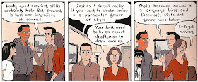

("You don't have to be able to draw, but we'll assume that you want to learn how.")

The idea that simple drawings can still tell a story is front and center in Adventures in Cartooning, which begins with a princess complaining that she “just can’t draw well enough to make a comic”—and immediately contradicted by the Magic Cartooning Elf, who shows how a few basic shapes can be doodled into the main props and settings of the story that follows.


("Anyone can draw that stuff!")

The design of the characters in Adventures is inspired in part by Ed Emberley’s Make a World: each is built out of a few simple shapes that are easy to repeat. The difference between this simple drawing (which is possible for anyone who can write letters) and bad drawing turns out to be mainly about the difference between gesture and stiffness, not the ability to render a horse that looks like a horse. Here, Adventures in Cartooning teaches by example: little more than a stick figure, the knight is still full of lively and even exaggerated motion.

2. Since words and images can work complementarily in comics, you can use descriptive words to get you out of a drawing jam.
I don’t remember this coming up, at least not in quite this way, in Drawing Words & Writing Pictures, but it’s a great point for novice cartoonists who aren’t feeling secure in their drawing chops. Some things are hard to show, but there’s no reason a character can’t name a thing like that to make its identity clearer. A small closed squiggle can become a bubble-gum wrapper; a few rectangles in the background can become a mile-high stone wall. And let’s remember that even the most painstaking draftsman is still going to rely on language for invisible effects like smell and sound.

3. You don’t have to perform fancy tricks with layout in order to take advantage of “special effects” of panel height, width, and size.
Most of the page layouts in Adventures in Cartooning are straightforward variations on a grid, but each layout is deliberate and directed at a particular effect. (Again the book sets an example for the kid (or student) without much commentary.) A square panel has a different sort of action than a panel with horizontal aspect, because a horizontal panel is better at establishing setting or motion along a surface; a vertical panel is good for ascent, descent, or growth; a row or grid of similar-shaped panels is good for showing progression; and so forth.


4. Leave room at the top of your panel.
One of my favorite moments in the book, which happens before the Magical Cartooning Elf explains the virtues of different-shaped panels, shows the knight and his horse ascending a mountain and, because of the rising ground, seeming to bump against the top of the panel. Maybe this “lesson” isn’t what Sturm and his collaborators had in mind, but I have seen plenty of panels drawn without a thought about speech balloons, then having to crowd dialogue into a tiny attic over the characters’ heads.


5. Drawing is fun, and drawing together is fun.
This might be the most important lesson in Adventures in Cartooning, and again it comes through implicitly, both in the fun of the drawings themselves and in the solution to the knight’s ultimate crisis. (Having fallen in the ocean, several knights are drowning until, working together, they draw a pirate ship they can sail away on.)


("We call this a jam.")

Little kids mostly don’t need to be told this, but the fun of drawing would probably be the hardest of these five lessons for me to convey in a comics class. That’s because the college students who need this lesson aren’t likely to take a course that requires them to draw every week, and teenagers who think they can’t draw aren’t likely to have an Ed Emberley conversion moment when they’re being graded. By the time young people have passed from the Adventures in Cartooning target demographic to that of Drawing Words, they may have been discouraged out of telling stories with pictures. It’s a tragedy Adventures in Cartooning is trying to forestall. For those lost cartoonists, a healthy dose of Lynda Barry might jolt them back to a kid’s pleasure in making worlds and telling stories. Or maybe I should just casually scatter a half-dozen copies of Adventures in Cartooning in the library’s study area.

(This post just had a couple of comments, which I've allowed to evaporate into the ether. Perhaps you'd like to add your own now.)

Sunday, January 1, 2012

Alphabeasts: L is not for Landshark

I haven't done my drawing for this week's Alphabeasts post yet. And in fact, I didn't even want to look at one of the horrible beasts I had as an option this week.


Is it possible that you haven't heard of the Landshark? (By which I do not mean the bulette.)

Well, the real Alphabeast will show up some time after midnight, as usual.

My Panelists Archive: Comments on "The Playwright: the Page and the Stanza"

Imagine my surprise when, after I'd written about the latest Eddie Campbell collaboration, the authors of The Playwright stopped in to set the facts straight.


First off, my Panelists colleague Derik Badman said:
Great analysis, Isaac. I like the concept of enjambment applied to comics.

I wonder if we could say the same thing happens where someone like Hergé use the turn of the page to break the suspense/release of some action or event. The final panel of one page leaves the narrative flow up in the air, leading to the conclusion of the beat for the beginning of the next page.


To which I replied:
Oh, sure. That’s not just Hergé; I’d say it’s a sort of fundamental principle, especially for a story that’s serialized: the last panel offers at once a conclusion of what has come before and a promise of what’s yet to come. In an action story, that could be a cliffhanger; in different sorts of stories, different sorts of resolution and tension are important.


And another Panelist, Jared Gardner, said:

Great stuff, Isaac. I will never regret Campbell’s beautiful color work in this edition (indeed, his use of color has been the biggest revelation in his work in the last few years, after decades of admiring him as one of the great practitioners of b&w comics), but I would so love to see this in its original 9 panel form. I’ve bugged everyone I know to see if they have a copy, but no luck. Anyone out there in TV land have some pages to share?


And then Daren White, Campbell's coauthor, said:

There were only three chapters published in the 9 panel grid format (actually, most were 7 panels) and a further single chapter written before the change in format. Top Shelf still have DeeVee 2007 in stock, which contains one such chapter.

To which I could only reply:

I stand corrected!

I wonder — would it be unseemly for me to edit my essay (or whatever that was) in light of this new knowledge?

And are you saying that some of the chapters in the current edition were set up in a regular seven-panel grid? (If so, what was the layout of that grid? It’s hard to guess. And how were those chapters transformed for the current edition? I’m genuinely curious.)


White answered,
Oh no, definitely not. I’m enjoying these and hesitated about posting because I wouldn’t want to influence anyone.

There wasn’t a strict template, rather what seemed to fit the scene. In the earlier chapters we simply cut the pages into tiers. I don’t recall any panels moving between ties, hence the two and three panel pages in the final book. I think there is only a single splash (the Playwright looking at the movie poster on page 81) where the image was edited, marginally, to make it better fit the new format.

I did go into a bit of detail about the re-formatting in this interview at Comics Reporter.


And then Eddie Campbell added:

Isaac. I enjoyed your piece. I don’t want to get mixed up commenting on critical writings here, but I see where some clarification might be helpful. Daren’s ‘seven panels’ might be confusing. The seven were still on a ‘nine panel grid’ (as they say) with a couple of pairs joined, is what he was saying. With the later chapters I just drew them as single tiers but otherwise to the same size specs, which means if you see nine-panel divisions in the actor chapter, that’s a) coincidence b) me doing it subconsciously, or c) Daren still thinking that way in his script. All of those are possibilities, but the tiers were never arranged that way at any time even accidentally as far as i can recall. The artwork is in two piles in different formats. Half of the book as it currently stands was done in 9-panel format. The colouring was done on xeroxes soaked and stretched.
A little photoshopping was done at the 12th hour, but that was negligible to the overall finished thing, being confined to dropping in a few wallpaper effects, and one photographic face. I was trying out a few tricks for my next book, which is entirely done on the computer. as you were. :)

one other thing. I seem to recall that the actor chapter might have been the very last thing done and therefore the number of pages we had left to fill would have had a bearing on the final shape of that chapter. Coincidentally, at six pages, or tiers, it does fit the nine-panel set-up, but if you look at the final chapter, ten, you’ll see it comes to 16 tiers and doesn’t fit the ‘nine’. Similarly, chapter 8 comes in at 17 tiers. All of this sounds a bit statistical, but you know what I mean.
You were on the right track.


I replied:
I had noticed while I was re-reading the book for this piece that I had a hard time “figuring out” the original pages for a couple of the chapters — though even chapters eight and ten have a few three-page “beats” that I was able to imagine as three-tier pages. (I’m thinking p. 126-128, p. 153-155, p. 156-158.) Even if those never existed as three-tier pages, they seem to be working with that nine-panel rhythm. I’d be surprised if the nine-panel rhythm hadn’t become nearly an instinct for you by now; as I said, I consider you a real master of this form, so I mean that in a complimentary way. Maybe these “beats” are residual echoes of that familiar rhythm.

As for the actor chapter, I think you missed an opportunity if you never placed Bonaparte squarely in the center of a nine-panel grid. But there is always the next book …


Another Panelist, Charles Hatfield, added:

All of this has me thinking about Groensteen’s comments on the page as a hyperframe, and it occurs to me that that notional hyperframe may be something that comics artists carry around in their heads at all times: an internalized awareness of the book or page as an object, as literally the medium of delivery.

Often I see poems, short lyrics typically, printed on a page and then capped by an enormous amount of white space—the blankness that delimits the poem and establishes it as something complete and done. In contrast, I seldom see gridded comics in which the grid ends in mid-page and is capped by white space. Occasionally, yes, but not often. Of course I remember plenty of instances (usually in old comic books) where the grid is finished by some non-diegetic material, usually some kind of publisher hype, but even that becomes a way of filling out the hyperframe.

Maybe it’s just a commercial consideration: get some ads into those empty spaces! (Sometimes aesthetic preferences start as economic matters: dig the use of alternating color and B&W in some of the great Modernist picture books, for example.) But, for whatever reason, comics drawn in grids typically fill every page, top to bottom. The rare exception often comes on the last page, a kind of Finis gesture.

This is one of the reasons I found Chester Brown’s autobiographical books so interesting: they had no discernible grid. Rather, they insisted on isolating individual panels against lots of blank space, black or white. Of course, when Brown got to Louis Riel, he returned to the six-panel grid with a vengeance, but then there are a couple of highly fraught instances where that grid is left incomplete, or unfilled—which becomes so powerful when most of the work is relentlessly gridded.

The notional “page” that ends up being printed on real pages is a powerful idea in the minds of many comics artists, I’m guessing. Even an ideological thing.


Derik Badman pointed out:
“I seldom see gridded comics in which the grid ends in mid-page and is capped by white space.”

Dash Shaw does that in some of his books, he talks a bit about it in an interview he did on Ink Studs.

Brown’s idiosyncratic approach in some of his books came, I believe, from the way he was drawing the panels and then laying them out on the page as kind of a collage process. I suspect most cartoonists don’t work that way (though it would be easier now, if one worked digitally), so following the grid, or filling up the page becomes a kind of mathematical limitation… not mention economic, since all that empty space with no content starts ballooning the size of your comic and the cost of making it.

(Maybe that is all obvious.)


Charles replied,
Yeah, Brown shows himself (in the autobio metacomic “Showing Helder”) pasting or taping down individual panels. He would draw them one by one, cut them out, and lay them down on the board.


And I chimed in,
There’s an early Spiegelman strip (“As the Mind Reels”) that leaves its last tier blank, as a sort of indication that things have broken down and the transmission has stopped.

But I think in most cases the motive to fill the page has something to do with economics, as Derik hints. More blank space means more pages, which means a more expensive print run.


Finally, Sean Michael Robinson said:

Totally agree with this reading. I think that economics, and economic’s first cousin, expediency, are invoked much less often than they could be in critical discussions, so cheers to you and Derik for doing so. I was thinking about this just today reflecting on the density of some of the “Alec” comics- some discussion of that at HU in the comments section.

Oh, and enjoyed this whole post- and completely agree with you re: that page from King Canute Club- especially love the attitude in the middle tier far right panel. Some really muscular inking as well.

My Panelists Archive: The Playwright: the Page and the Stanza

The real highlight of my next piece for The Panelists wasn't so much the essay but the comments section, which will go live as an archive here on this blog in about twelve hours. We were doing a week on the work of Eddie Campbell, and I came out of semi-retirement as a comics critic to write this:


As part of our week devoted to the works of Eddie Campbell, I’d like to expand on something Charles noted about The Playwright yesterday, in a way that might help me understand why The Playwright doesn’t, at least to me, really feel like an Eddie Campbell book.

As Charles noted, the original black-and-white serialized version of The Playwright appeared in DeeVee in a different format, the layout of each page working from a three-by-three grid. In Top Shelf’s The Playwright, these nine-panel grids are reformatted one tier (usually three panels) to a page, which shouldn’t seem like a significant alteration. Having only reconstructed the original DeeVee pages in my head, except for the one that Charles posted, I can’t testify to the actual effects of the change. But I think it’s within my purview to offer some speculations.

Eddie Campbell is a master of the nine-panel grid, and his mastery comes chiefly in his sense of timing. The Alec books are full of single-page anecdotes that build to their punchlines with the timing of an expert pub-stool raconteur. Here, for example, Campbell the self-publisher tries to explain to his daughter where the money comes from.


Notice the way the first tier sets up the anecdote and delays its beginning, establishing a casual tone. (And yes, the title panel takes up one of the "beats" in this grid.) This same joke could have been told in four panels with a little condensing, but the newspaper strip isn’t Campbell’s native format, and that’s not his customary pacing.

One of my favorite Campbell nine-panel grids is from The King Canute Crowd, and it’s interesting to me partly because of the ambiguous relationship between its text (in part, an anecdote with a nice punchline) and its images (Alec cleans his glasses and gives a slight smile). But I’m also really interested in the rhythm of this page, the uneven movements of its notional “camera,” the blank panel accompanying the punchline, the way the images are a self-contained unit but the text carries over from the previous pages—all in all, it’s a fascinating little bit of comics timing.


Plus, you have to feel a little nostalgic about the way Campbell “paints” with Zipatone.

Just between the Alec omnibus and From Hell, Campbell has easily eleven hundred pages of nine-panel grids under his belt, and that’s not counting Bacchus or any of his other projects. It’s his favored format, and I’d imagine that by this point in his career, he could spin any event, from removing a splinter to the fall of Rome, into a well-paced page on that grid of regular intervals.

Granted, The Playwright is drawn from Daren White’s script, but I can’t help watching for Campbell’s storytelling rhythm in the book. And in fact I think it’s there, but the current edition obscures it, or overwrites it with another rhythm. In most of the chapters of The Playwright, it’s not hard to reconstruct the original pages as you read, and to see that each set of three tiers holds together in a way that those tiers don’t mesh with the ones before or after them.

The first chapter, for example, is built from two three-tier pages of voyeurism on the bus, a page on the girl with “ever-so-slightly crossed eyes” that our protagonist Mr. Benge once dated, a page of swipes from old erotica (mostly), a page on Uncle Ernie, and a page of Mr. Benge making and serving tea. Each original page has its own subject, and each would serve as what Will Eisner called a “metapanel,” containing its several discrete units in one larger unity. The new edition reconfigures the existing panels into smaller syntactical chunks, and it alters the rhythm of the story.

I know I’m not the first person to draw a comparison between the regular intervals of a comics grid and the regulated stresses and measures of metrical verse. Since I spend a lot of time in my day job thinking about the structures and rhythms of poetry, I tend to think of the comics page as analogous to the stanza in formal verse: a fixed space in which a large or small amount of action can take place, a measured unit against which a number of different rhythms can be deployed.

When the syntax of a poetic sentence runs over from one line to the next, the energy or tension that line break creates is called enjambment, and we could fruitfully think about the ways that comics scenes or story beats can be enjambed not only from tier to tier but from page to page, even when there’s no page turn involved. Many poets (and many cartoonists) will instead use the natural interruption provided by a stanza break (or a page break) to shift locations, conclude sentences, or otherwise divide one unit of meaning from another.

Thinking about it through this analogy to poetry, we could say that the original published version of The Playwright, constructed out of fairly unified pages that attach less strongly to each other, is not a heavily enjambed comic: the energy that pulls us from one page to the next is more a question of narrative than syntax. Creating more divisions within the pages, making each original tier its own new page, changes this somewhat: now, from page to page, we have a varying amount of “syntactical” pull. Sometimes the end of a page marks the end of a thought; sometimes it’s only part of an incomplete thought.

We also lose some effects of layout: the heroic genital endowment of “the actor,” for example, is squarely in the center of its original page (panel five of the nine-panel grid); its daunting omphalic (well, just phallic) centrality no longer dominates the tiers of images before and after it.

And we lose the force of nearly half of Campbell’s (or White’s) punchlines in this new format: if the first tier of what was a three-tier page is now on the left side of the book, its final tier will also be on the left, sharing visual space with the beginning of the next (original) page. That problem is a little difficult to describe, but it’s easy to show you. Here’s an imaginary or reconstructed version of that page of swiped erotica from the first chapter, laid out as I imagine it was in DeeVee:


And here’s the way it now appears in The Playwright.


The vulgar openness of the final panel is, in the original, set against a set of demure and old-fashioned concealments; full-body portraits are abruptly replaced with a close-cropped, partial, and fleshy torso. In the single-tier formatting, however, the punch of that final panel is somewhat diminished. I suppose we could argue that in its new position this panel draws a metaphor to the folds where the book’s two pages meet (an interesting reading that I don’t think I can entirely support). Or we might argue that there’s something gained by juxtaposing the more lurid moments of the playwright’s imaginings with poor domestic Uncle Ernie. In this case, however, I think I miss the set-up and release of the original, and something of its emphasis on the playwright’s chaste repulsion from the biological. In other words, I think the rhetoric of the original layout is stronger.

But that’s not to say that I would call The Playwright in its new edition crucially flawed. I haven’t said anything about the various benefits Campbell is able to wring from handling the story in color. (Robert Stanley Martin has written insightfully about the significance of particular colors; I am also interested in the way that hand-coloring the book’s repeated photocopied panels or enlargements undermines and revises its interest in stasis or repetition.) The new rhythm of the reformatted Playwright just strikes me, I suppose, as less poetic, and more like the prose of a novel or essay. We move from page to page in this book as we would from sentence to sentence in a paragraph. That’s appropriate enough to its subject matter: this is, after all, a sort of a biography, and those don’t generally come in stanzas anyway. I do wish I could read them both side by side to make my choice between them.

Stay tuned for that comments section!