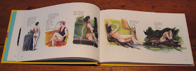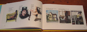
As part of our week devoted to the works of Eddie Campbell, I’d like to expand on something Charles noted about The Playwright yesterday, in a way that might help me understand why The Playwright doesn’t, at least to me, really feel like an Eddie Campbell book.
As Charles noted, the original black-and-white serialized version of The Playwright appeared in DeeVee in a different format, the layout of each page working from a three-by-three grid. In Top Shelf’s The Playwright, these nine-panel grids are reformatted one tier (usually three panels) to a page, which shouldn’t seem like a significant alteration. Having only reconstructed the original DeeVee pages in my head, except for the one that Charles posted, I can’t testify to the actual effects of the change. But I think it’s within my purview to offer some speculations.
Eddie Campbell is a master of the nine-panel grid, and his mastery comes chiefly in his sense of timing. The Alec books are full of single-page anecdotes that build to their punchlines with the timing of an expert pub-stool raconteur. Here, for example, Campbell the self-publisher tries to explain to his daughter where the money comes from.

Notice the way the first tier sets up the anecdote and delays its beginning, establishing a casual tone. (And yes, the title panel takes up one of the "beats" in this grid.) This same joke could have been told in four panels with a little condensing, but the newspaper strip isn’t Campbell’s native format, and that’s not his customary pacing.
One of my favorite Campbell nine-panel grids is from The King Canute Crowd, and it’s interesting to me partly because of the ambiguous relationship between its text (in part, an anecdote with a nice punchline) and its images (Alec cleans his glasses and gives a slight smile). But I’m also really interested in the rhythm of this page, the uneven movements of its notional “camera,” the blank panel accompanying the punchline, the way the images are a self-contained unit but the text carries over from the previous pages—all in all, it’s a fascinating little bit of comics timing.

Plus, you have to feel a little nostalgic about the way Campbell “paints” with Zipatone.
Just between the Alec omnibus and From Hell, Campbell has easily eleven hundred pages of nine-panel grids under his belt, and that’s not counting Bacchus or any of his other projects. It’s his favored format, and I’d imagine that by this point in his career, he could spin any event, from removing a splinter to the fall of Rome, into a well-paced page on that grid of regular intervals.
Granted, The Playwright is drawn from Daren White’s script, but I can’t help watching for Campbell’s storytelling rhythm in the book. And in fact I think it’s there, but the current edition obscures it, or overwrites it with another rhythm. In most of the chapters of The Playwright, it’s not hard to reconstruct the original pages as you read, and to see that each set of three tiers holds together in a way that those tiers don’t mesh with the ones before or after them.
The first chapter, for example, is built from two three-tier pages of voyeurism on the bus, a page on the girl with “ever-so-slightly crossed eyes” that our protagonist Mr. Benge once dated, a page of swipes from old erotica (mostly), a page on Uncle Ernie, and a page of Mr. Benge making and serving tea. Each original page has its own subject, and each would serve as what Will Eisner called a “metapanel,” containing its several discrete units in one larger unity. The new edition reconfigures the existing panels into smaller syntactical chunks, and it alters the rhythm of the story.
I know I’m not the first person to draw a comparison between the regular intervals of a comics grid and the regulated stresses and measures of metrical verse. Since I spend a lot of time in my day job thinking about the structures and rhythms of poetry, I tend to think of the comics page as analogous to the stanza in formal verse: a fixed space in which a large or small amount of action can take place, a measured unit against which a number of different rhythms can be deployed.
When the syntax of a poetic sentence runs over from one line to the next, the energy or tension that line break creates is called enjambment, and we could fruitfully think about the ways that comics scenes or story beats can be enjambed not only from tier to tier but from page to page, even when there’s no page turn involved. Many poets (and many cartoonists) will instead use the natural interruption provided by a stanza break (or a page break) to shift locations, conclude sentences, or otherwise divide one unit of meaning from another.
Thinking about it through this analogy to poetry, we could say that the original published version of The Playwright, constructed out of fairly unified pages that attach less strongly to each other, is not a heavily enjambed comic: the energy that pulls us from one page to the next is more a question of narrative than syntax. Creating more divisions within the pages, making each original tier its own new page, changes this somewhat: now, from page to page, we have a varying amount of “syntactical” pull. Sometimes the end of a page marks the end of a thought; sometimes it’s only part of an incomplete thought.
We also lose some effects of layout: the heroic genital endowment of “the actor,” for example, is squarely in the center of its original page (panel five of the nine-panel grid); its daunting omphalic (well, just phallic) centrality no longer dominates the tiers of images before and after it.
And we lose the force of nearly half of Campbell’s (or White’s) punchlines in this new format: if the first tier of what was a three-tier page is now on the left side of the book, its final tier will also be on the left, sharing visual space with the beginning of the next (original) page. That problem is a little difficult to describe, but it’s easy to show you. Here’s an imaginary or reconstructed version of that page of swiped erotica from the first chapter, laid out as I imagine it was in DeeVee:

And here’s the way it now appears in The Playwright.


The vulgar openness of the final panel is, in the original, set against a set of demure and old-fashioned concealments; full-body portraits are abruptly replaced with a close-cropped, partial, and fleshy torso. In the single-tier formatting, however, the punch of that final panel is somewhat diminished. I suppose we could argue that in its new position this panel draws a metaphor to the folds where the book’s two pages meet (an interesting reading that I don’t think I can entirely support). Or we might argue that there’s something gained by juxtaposing the more lurid moments of the playwright’s imaginings with poor domestic Uncle Ernie. In this case, however, I think I miss the set-up and release of the original, and something of its emphasis on the playwright’s chaste repulsion from the biological. In other words, I think the rhetoric of the original layout is stronger.
But that’s not to say that I would call The Playwright in its new edition crucially flawed. I haven’t said anything about the various benefits Campbell is able to wring from handling the story in color. (Robert Stanley Martin has written insightfully about the significance of particular colors; I am also interested in the way that hand-coloring the book’s repeated photocopied panels or enlargements undermines and revises its interest in stasis or repetition.) The new rhythm of the reformatted Playwright just strikes me, I suppose, as less poetic, and more like the prose of a novel or essay. We move from page to page in this book as we would from sentence to sentence in a paragraph. That’s appropriate enough to its subject matter: this is, after all, a sort of a biography, and those don’t generally come in stanzas anyway. I do wish I could read them both side by side to make my choice between them.
Stay tuned for that comments section!
No comments:
Post a Comment