Monday, December 31, 2007

New David Mazzucchelli release in December 2008!

Breaking news from the MLA convention:

At the Random House booth, a graphic novel checklist from Pantheon Books listed eight new releases for 2008. Mind you, a lot of their "new" releases are new editions of previously released material, though some of it hasn't been seen for a while, or not at all in English yet. In addition to paperback editions of Charles Burns's Black Hole(January) and Jessica Abel's La Perdida(May) are a second volume of Joann Sfar's The Rabbi's Cat(April) and the long-awaited Art Spiegelman collection Breakdowns: Portrait of the Artist as a Young %@&*! (October), which includes work long out of print (and expensive on the used-book market). All of this is great news—I prefer to assign paperbacks to students rather than hardcovers, and more of the Rabbi's cat in English is always welcome. I imagine volume two will go at least as far as to include the fifth (French) volume of The Rabbi's Cat (the first English-language volume comprises the first three French-language albums). That extra-long volume, Jérusalem d'Afrique, is at times shocking; it may be my favorite single work by Sfar (not that I've read that much by him).

The real shock, though, is seeing a work advertised by another favorite cartoonist. Coming in December: Asterios Polyp by David Mazzucchelli, an artist barely seen in bookstores since his masterful collaboration with Paul Karasik on the graphic-novel version of Paul Auster's City of Glass. I'd link to more information about the forthcoming book, but it's not listed yet on either the Amazon or the Pantheon websites. Here's what it says in the brochure:
Mazzucchelli triumphantly returns to the graphic novel with this fascinating portrait of an accomplished architect who attempts to escape his past, only to find that it has long since shaped his future.
That's it. No pictures, no page count, no price listed, though there is an ISBN (978-0-307-37732-6 hc) and a phone number to call for orders: (800) 733-3000. No doubt more info will trickle out by next December, but this bombshell news was too good to keep!

Sunday, December 30, 2007

Chicagoland Comics

If the blog has seemed kind of quiet lately, well, it's been that time of the year for Isaac and me both. Semester's end is always busy, but right after classes were done I also spent some time traveling with my family (one comics-related detail of that trip should appear on the blog in a week or two; here's a hint: "¡PLOP!"). And right after the trip came the annual Modern Language Association convention—or rather, I came to it, 'cause here I am in my hotel lobby in chilly but beautiful Chicago, IL, with one more day of the conference to go!

It's a pleasure to wander the streets downtown (cold as they are) just to marvel at the skyscrapers; it's doubly fun to do so shortly after having taught Chris Ware's Jimmy Corrigan, the Smartest Kid on Earth, which makes such rich and interesting use of Chicago's architectural history. At one point I caught myself wondering if I could spot the corner where Jimmy sees Superman jump off a building to his death; I suspect (but do not know) that Ware modeled that streetcorner on a genuine spot in the city.

Isaac had the further pleasure of giving a short paper on Chris Ware in a panel at the convention on Thursday. I should probably let him talk about that one (especially since I was sadly unable to attend).

The only comics I've seen in Chicago this visit are two minicomics that came up at the home of my friend (and contributor to Satisfactory Comics #5) Jenny Blair and her sister Lisa. Over Shabbes dinner, the sisters Blair showed me a delightful comic by the sometimes cantankerous comics critic Noah Berlatsky. Called Superheroes I Have Known, it's a charming piece of faux-naïvery featuring what look like a child's drawings of superheroes who are quirky in a very childlike quirky way, with each drawing accompanied by a handwritten description of what "I" knows about the superhero in question. It could easily have been an arch, self-satisfied production, but damn if it isn't actually charming—not least because some of those quirky heroes are Grade A funny. I for one wish there were more to read of Shellock Holmes, the crab detective, and his cetacean sidekick ("Elementary, my dear whale!"). The best part? It's priced to sell: 50 cents at Quimby's in Chicago, possibly still available from the author via the comic-title link above.

The other comic I read is not for sale, but you can read it for free right here (or in its original context on Lisa Blair's blog for November 8, 2004). It's an autobiographical page drawn by Jenny about Lisa's purchase of a suitable plant to serve as a Christmas tree. Like me, Jenny converted to Judaism (with a visual cue in her self-caricature: look for the small Hebrew "chai" necklace in panel six), and this page shows her peaceable ecumenical enjoyment of a family Christmas tree. I admit I enjoy seeing the strangeness of having an outdoor-style tree indoors, all the more when it's decorated unlike any natural tree in the woods. So in that ecumenical spirit, I hope those of you who celebrate Christmas are still enjoying your twelve days thereof!

More updates more regularly, and soon, I hope!

Sunday, December 23, 2007

Page 10, Inked

Getting through the end of the semester is never easy, but I always try to submit my grades on the same day that I give my last exam, so I can get back into the other things I always have to neglect at the end of the term. (For example, there's the MLA paper on Chris Ware and "the grammar of diagrams" that I'm delivering on Thursday; I still need to write that.)

But now that I've had a couple of days to recover from the end-of-term grading marathon, I have been able to put a few minutes into redrawing Ipthorin in one panel, then a couple of hours into inking the page. It's not the best cartooning I've ever done, but it is finished (I think), which is what matters.

Please, I beg of you, click on this image to see how our story ends.

I invite you to notice that I have not merely satisfied Jesse's remaining two constraints—as long as you count the middle of the second tier as a panel, it's the third silent panel in a row; the third panel on that row is mostly swiped from Jesse's recent and awesome Bluefuzz minicomic. Not merely, indeed, for I have also chosen two constraints from each of the preceding four sets of constraints and nodded to these in individual panels: the Corrigan and the Reverse Corrigan; the shop-sign and the Passion of Joan of Arc; the Ditko and the Segar (also a little nod to the J. Chris Campbell in the transition to the last panel); a borderless panel and a reference to Duchamp; even (why not) a panel of pure silhouette. You can see signs of me planning this stunt on one of the thumbnail pages I posted back in November. I'm surprised no one commented on that.

We're planning to leave the whole story up on the website for a little bit longer, but we'll pull most of it down when we start coloring the pages and printing them as postcards. When that happens, you'll have the option to buy a copy of the story, either all at once in a single envelope, or serialized to you (or the recipient of your choice) in the mail one page per week.

Meanwhile, please enjoy it in black and white for free, while it's here. I encourage you to use the comments section to discuss overarching themes in the story. For example: what view does this story take of potentiality and the realization of a single potential? What does that imply about the authors' apparent unwillingness to "grow up"?

Wednesday, December 12, 2007

Elfworld Ephemera: Kalbi in the Kitchen

While Isaac takes care of the letters & inks on page 10 (pencils in the previous post, just below this one!), I thought I'd offer up a little bit of doodling vaguely related to the tale.


This drawing is dated October 30, and I'm not sure what prompted it; maybe the arrival of Hallowe'en put me in mind of kitchen witches, one of which dangles from the wall there, and I figured I'd better make my doodles vaguely useful by practicing a character from our story. So here's our faithful dog boy, whipping up some dog chow in a kitchen that looks a bit like the one in my old apartment...

Incidentally, those numbers at the bottom left puzzled me for a moment until I remembered why I'd staggered them: those toward the left indicate the pages drawn by Isaac, those on the right the pages drawn by me, and the slashes indicate which we'd finished by this point. Pity those last two pages both took ages to post!

Pencils for p. 10 (obstructed story)

Hey, here are the pencils for the last page of the Elfworld submission. Sorry for the delays.

You'll want to click this thumbnail to enlarge it. I mean, if you want to read the page.

You can see the fancy special effects I used to indicate the panel where Stepan steps into Serkja.

I'm planning to get to work on the lettering as early as tomorrow, and to work gradually on the inks over the weekend. No sense rushing this thing now. If you've got any comments, please let me know. There are a couple of panels where I'm not a hundred percent happy about the composition of the image, but I also feel like the page is at least mostly good enough.

Did I miss anything? Have I made any dumb mistakes? Does this count as an ending? Why do I feel less certain about p. 10 than I did about p. 1, when we had no idea what the comic would even be about?

Tuesday, December 11, 2007

Acme Novelty Datebook, vol. 2

I've finished the pencils for p. 10, and I want to post them tonight so I can get feedback before the inking starts, but the batteries in my camera are drained, and my scanner doesn't pick up pencils well. I'm recharging the camera batteries right now.

Meanwhile, let me note that in the past two days, I got a couple of books that promise to keep me busy in any spare minutes I might have between now and the spring semester. One is The Complete Calvin and Hobbes, which I got on Amazon for a ridiculously low price (something like $58 instead of its $150 cover price); the other is the new second volume of the Acme Novelty Datebook, which is a powerful reminder of the value of keeping a notebook. Chris Ware draws and thinks like an utter genius, even in his moments of self-loathing or idle time. It's hard to think of a more impressive record of a cartoonist's working process, or a more impressive book of incidental drawings.

Like the volume before it (and like the final paragraphs of Gulliver's Travels which I happened to re-read this morning), this installment of Acme Novelty Datebook is a stern rebuke against pride.

If Chris Ware tells himself, every day, many times a day, that he sucks, then what can the rest of us think of ourselves?

Sunday, December 9, 2007

Name our story and win a prize!

Now that we're almost done with our tale, we're really starting to feel the need for a title. Isaac thoughtfully left a space for one back on page 1, but that space is still blank, and we're having a hard time filling it ourselves.

It's not for lack of ideas; instead, we have too many! Of course, this confusing profusion of possibilities fits the underlying theme of our story: just as the shadowfolk resist the creation of a map that would fix their shifting contours into one shape, so too we don't want to decide on a single title that would foreclose all the other likely titles.
At least, that's what we've been telling ourselves. The other possibility is that none of our proposed titles is really satisfying enough to stand on its own, and each only seems plausible because it alternates with a bunch of other okay-but-not-great options.

Which brings me to our invitation to you, our readers: we appeal to you to come up with a better title than the ones we're working with! Use the comments to offer up any ideas you have. We do not guarantee that we will settle on a reader's submission for our title, but if we do, I will express our appreciation by sending you your choice of either the ultra-rare Tales from the Classroom or a finished drawing of the character(s) of your choice, up to a group shot of five figures. Still not interested? Well, we'll be really grateful! How about that?

Just so you know what you're up against, here are some of the potential titles we've been tossing about:

The Uncharted World • Unsettled Territory • The Unmade Map • A Map of the Possible • The Chart of the Possible • Stepan's Story [working title] • Vague Terrain • Border Dispute • Shadowy Cartography • A Map of the Invisible

Saturday, December 8, 2007

The Streets of Serkja

Another one of my challenges in setting up page 10 is incorporating a panel's worth of "found" imagery. I'm going to bend the rules a little bit by superimposing Stepan over part of the image, but I'm working on a background for the panel where he walks into Serkja for the first time.

I'm going to post what I've got, partly because I'm not planning to spend a whole lot more time on this part of the project today (and posting this for feedback will keep me from tinkering with it this afternoon). I'm also curious to see what you think of the approach. It's not perfect, and I think I need a little more "crowd" in some parts of the image. But click this to enlarge it, and see how you like this background.


I can simplify, or enlarge, or shuffle things around -- it's all in layers still in my master document, so I've got some freedom to adjust.

UPDATE:

Here's a version without the singers, and with some proportions and sizes adjusted, for legibility. (Remember, this is just one smallish panel!)

What do you think?

Friday, December 7, 2007

Model Sheet for Ipthorin

So, I'm going to try to work on those pencils for a while tonight, and it occurred to me that I needed to decide what Ipthorin looks like. I haven't heard any strong objections to the dinosaur head, which does explain why Stepan calls him an "old lizard" on p. 1, so I'm going to stick with that.

But I needed to figure out his head shape. Does he have a beak or not? How blunt is his nose?

Moreover, I needed to settle on a wardrobe. We don't see a whole lot of Ipthorin's body in most of these panels, and when we do he's at a decent distance, so I probably could have made things up as I went along, but I wanted to know what I was dealing with.

This first design doesn't quite work. The collar looks silly. Not sure what I was thinking, there, except maybe trying to conjure up some Dr. Strange, or maybe some Elvis.

This is better. Since he's an old man, I like the downward droop of his robe, as if he doesn't really have shoulders. And those squiggles on the front of his robe are meant to evoke magic, serpents, and whatever else Alan Moore has been worshiping lately. Actually, they're just a simple ornament: no sense getting all detailed if we're only going to see Ipthorin drawn very small.

I'm hoping to have more to show you in a day or so.

Thursday, December 6, 2007

I'm Working On It

Hi. I know that I'm late getting those pencils for p. 10 finished. They're scripted. I'm working on them.


... but I'm also having the end-of-the-semester crunch, with a few things left over from last week. It might be a few days before I get the pencils posted. Sorry.

Friday, November 30, 2007

Page 9, inked

All right, folks, we're getting down to the wire—but there's my last page for our Elfworld submission, right there!

Constraints: Silhouettes in every panel? Check!—even if they're tiny in panel 6. Overheard dialogue? Check!—even if it isn't very colorful ("What's going on here?"). Something concealed? Check!—as implied in the final caption of the page.

My work as a cartoonist is done here. Now I just get to enjoy my work as a kibitzer. Isaac: bring it on home with page 10!

Thursday, November 29, 2007

Happy birthday to MW!

...which is to say, happy birthday to me, nel mezzo del cammin di nostra vita. I just had to share an image of the delightful back cover of the brand new Osamu Tezuka manga that my beloved wife Becca just gave to me as a present:


It really makes a boy feel loved. Thanks, sweetie!

Wednesday, November 28, 2007

Thumbnails for p. 10 (obstructed story)

Well, the deadline for Elfworld vol. 2 is supposedly December 1, so I'm going to have to scramble to get this last page finished in time. It occurred to me this morning that I haven't ruled panels onto a page since before SPX. (Yikes.) No wonder my drawing desk is so cluttered with non-drawing detritus.

Getting the thumbnails for this page has been sort of difficult. I made a first false start last week, while my students were taking a midterm. Please click to enlarge this, so you can read my draft of the script:


...But this morning I reworked the first three tiers a little bit, so I'd be able to make Stepan's walk through the shadow-realm a little clearer in "panel" 4 (actually a space between panels), and to give Stepan more room to make his (newly scripted) pronouncement about why he won't map the shadow-realm.


I'm not sure whether I'm going to keep the nod to Emily Dickinson in there -- it seems a little silly -- but I also haven't thought of a clearer way to say what Stepan means: that the real crime in mapping the shadow-realm is in forcing it to be one thing forever.

As for the constraints: as long as "panel" 4 counts as a panel, I've got three silent panels in a row. And I mean to swipe / scan images from a few different sources in panel 5, which is the one that defines the look of Serkja, where Stepan is supposed to meet Ipthorin.

Will Iphtorin still look like he has a dinosaur's head when I finally draw him? Time will tell.

Comments and suggestions are, as you know, not just welcomed but invited. By me. I invite them.

Sunday, November 25, 2007

Pencils for p. 9 (obstructed story)


Okay, some comments and questions about the above.

Comments:

First, I plan on adding more prone shadow forms in the long fourth panel, and the panel will get lighter (fewer shadows) and more defined (sharper lines) as it moves rightward toward the glowing map, which I hope will help to spotlight Arntham's head, as well. The backgrounds in the panels with Stepan and the speaking shadows will also have some wispy undulating shapes in black, like those suggested in panel 1 and toward the middle of panel 4.

Second, I tried to make the shadows' dialogue sound less archaic; I hope that worked.

Questions:

Any recommendations for different balloon / caption placement? In panel 1, "Do I dare?" looks a bit crowded to me; I could move it to the lower right. In panel 8 (left of bottom tier), I'll probably condense the second shadow's dialogue to "You'd do this?" so that I'll have room to show Stepan's other hand. And in panel 9 (middle of bottom tier), the page number is currently a bit off-center to the left, which is good, because it's smack where I want to place the shadow's word balloon, consarn it. I plan to move it to the exact center, for consistency with the other pages, but frankly I'm not happy about the crowding in this panel.

Finally, are the background figures too small in panel 5 (left of third tier)? Tell me what I need to hear and I can adjust if necessary.

Poetry Submission Guidelines

This is a non-comics post, inspired by the stuff that kept me away from comics this weekend.

Some of you may know that, in addition to my other jobs, I am the poetry editor for Confrontation, the literary journal published by Long Island University. I've spent the weekend reading unsolicited poetry manuscripts. I probably sent out two hundred rejection slips between Wednesday and Saturday. Lots of fun, that.

In the hope that this post will occasionally get hit by a googling, would-be-publishing writer of poetry, let me suggest a few guidelines for writing and submitting poems. None of these are hard-and-fast rules, and I can't claim that Confrontation uses them as strong criteria, much less that they are universally applied. However, sticking with these guidelines may get your poems read (instead of simply discarded) by more editors.

The packet:

1. A cover letter is not your autobiography. It's good to write a sentence or two about who you are or what you have done, particularly if that informs your poetry in some way. On the other hand, telling the editor every trivial aspect of your life story only makes you seem like you crave personal attention. We don't care if you take walks with your dog, or if you recently returned from a vacation in Belize.

2. Send only a handful of poems. If you send more than four or five poems, and the first two or three don't interest me, I'm probably not reading to the bottom of the stack. Send only as many as will reasonably fit in your return envelope.

3. Submit to each magazine infrequently. There are a few people who seem to send poems to Confrontation about once a month. Sometimes they send the same poems twice, a few weeks apart. These people get read less carefully than others. Some of them are now getting their work returned unread. My rule of thumb: no more than once a year to any given magazine. But at the very least you must wait until your first submission receives some response.

The poems:

1. Justify left. Some people get the idea (from greeting cards, I think) that poems should be center-justified on the page. It's true that a poem with short lines sometimes uses a left margin that's pretty far from the edge of the page, and it's true that indentations and other typographical devices can deceive the careless eye. But very, very few serious poets have ever centered their lines on the page.

2. Put more than one word on each line. In high school, when I was first learning about poetry, I wrote a "poem" where there was only one syllable per line. (At fifteen I thought that was clever: I could put the line breaks wherever I wanted! And each new line got new emphasis!) Now I realize that the way syntax plays with enjambment is much more graceful when a line gets a chance to build up some sentence-energy before it's broken.*

3. Exclamation points should be used sparingly. Again, it's a question of the varying music of your sentences. Rules of thumb: no more than one exclamation point per poem; no exclamation points except in dialogue; no exclamation point at the end of the poem's last line. You are not Walt Whitman, and even he didn't exclaim everything.

4. Don't graphic-design your poems. I can imagine instances where graphic devices would be necessary, but they're usually used by clumsy amateurs. Clip art on the same page as a poem is a bad idea. Fancy fonts do not make your words any more poetic. Sometimes I get manuscripts in which each poem is in a different font, implying (to my mind) that they were word-processed years apart and have been living on in xerox copies since then: not a sign of careful revision practice.

5. Write about something beyond yourself. I don't mean that you can't appear in your poems. I only mean that the poems really need to have a subject beyond the ordinary events of your day and the private emotions they inspire. Describe something in the exterior world; make claims about some subject beyond you. Use language that exceeds your first conversational impulses. Consider distinct subjects and explore them imaginatively. This is the hardest rule of thumb for me to employ quickly, but it's also the source of the largest number of rejection slips.


All of these rules of thumb are based on years (yeah, yikes: more than a decade) of reading unsolicited poetry manuscripts, and identifying the surest signs of amateurish, crummy, dull, dopey, and laughable work. Any editor has to develop an intuitive rubric for sorting the slush pile: a set of guidelines that will identify work that takes no further consideration. That's what I use these rules of thumb for. They let me identify the poems that won't require more than a couple of seconds of my time.

If you are an aspiring poet who was drawn to this blog post by Google or some other means, and you're feeling discouraged, I have one encouraging rule for you. (I mean, something that will help your poems get better over time.) Though the rule has corollaries, it's essentially simple: read poetry. Read the poetry printed in books and in major magazines that are still way beyond your reach. In particular, read work that is a little bit outside your "comfort zone": something a little harder, a little more obscure, a little antique, a little unfamiliar. Buy a new book of poems every month, and devour what you buy. Write imitations; write responses; write critiques. Living an interesting life will give you good material for poems; reading published poems will help you develop the craft that turns experience into art.


*Before someone calls me on this, I should admit that I have written a poem in which a single word occupies an entire line. The poem is in syllabic meter, and one of the lines in each stanza is seven syllables long; the one-line word in question is Chroococcidiopsis.

Sunday, November 18, 2007

Thumbnails for p. 9 (obstructed story)

Our penultimate page. Stepan has just been transported to the shadow world by the shadow whom he bound to his will. But he had also agreed to turn the shadow loose in exchange for the journey. And so:

1) The once-kneeling shadow (Shadow 1) is now on his feet.
Shadow 1: Release me!
Caption: Do I dare?

2) The shadow has grown larger, more shapeless.
Caption: Do I have a choice?
Stepan: I'll keep my word, shadow. You're free!

3) The shadow is now huge, threatening, but Stepan is uncowed.
Stepan: Now—where's Arnthan?
Shadow 1: You don't command me now, boy—
Voice off-panel (Shadow 2): A MISTAKE!
NB: Shadow 2's panel has a distinctively wispy border throughout.

4) From far left, Shadow 1 and Stepan gaze at the ruin of the shadow world, which grows lighter and more fixed in shape as it moves to the right of the page. At the extreme right, we see Artham's once-again disembodied head on the ground. Glowing at the center of the wreckage is the map. A few pale shadow forms lie prone. Closer to Shadow 1 and Stepan is Shadow 2, a stricken look on its face.
Shadow 1: What—What's going on here?
Shadow 2: We've made a dreadful mistake!
Stepan (in the clutch of Shadow 1, looking at the disembodied head): Arntham!

5) In a wispy-bordered caption, Shadow 2 explains what happened while a borderless panel depicts what he describes. (NB: An alternative to this panel follows the script below.)
Shadow 2: We thought the danger lay in the mapmaker, so we slew him on arrival—

6)Close-up on the map, aglow and destructive, while Shadow 2's panel tails off-panel.
Shadow 2: —But the threat is in the map itself! We brought it here, and now it's petrifying everything!

7) Shadow 1, one arm still clutching Stepan, gazes determinedly at the wrack and ruin while Shadow 2 looks distraught. Stepan is tugging to remove Shadow 1's grip.
Shadow 1: Then we must destroy it!
Shadow 2: But it's deadly to our kind! You cannot go near it!

8) Stepan holds Shadow 1's arm away from him and stands freely. The shadows listen to him speak.
Stepan: But I can. What's more, I can consume it utterly with my magic.
Shadow 2: You would do this?

9) Stepan looks at the first, threatening shadow, whose hand now rests gently on Stepan's shoulder.
Stepan: I'll save your home, and I pledge to protect it hereafter. I only ask for Arntham's head and safe conduct back to my world.
Shadow 1: I give you my word, boy.

10) Stepan, silhouetted himself by the glow of his magic, is viewed from behind as he destroys the map.
Upper caption: My magic takes the map away...
Lower caption: ...but it gives me something in return.

*******
Okay, here's the alternative for panel 5:
The text is the same. The scene sets the two shadows and Stepan in the distance looking at the reader. In the extreme right foreground: Arntham's head. Poking into the extreme left foreground: the fingers of one of Arntham's dismembered hands. Never the twain shall meet!
****
Okay, the constraints. I had to have a silhouette in every panel. With my shadowy men on their shadowy world, that's easy. I also had to use found art or found dialogue. Since I want Isaac to have a chance to use one of those awesome Basque folklore characters on page 10, I tried to find some usable found dialogue. Folks—not easy! Either the crowds I was in were too loud actually to make out intelligible speech or what was intelligible was too contemporary and specific to be of use. (Washington politics and synagogue gossip have no place in this story!) Believe it or not, the best I could do was "What's going on here?"—genuine overheard dialogue, just not very colorful. C'est la guerre.

Finally, I had to conceal something that will be revealed by Isaac on the final page. It's good and concealed, all right, as the concealing is entirely suggested by Stepan's final caption. The constraint didn't specify a concealed object, after allso Stepan is concealing some information.

Anyway, that's what I've got. Isaac: you're left with found art and a wordless sequence, and I reckon you've got to get Stepan (and Arntham's head) back home. Everybody: feedback very welcome!

Friday, November 16, 2007

Gigantism in The Family Circus

A couple of days ago on the Comics Curmudgeon site, a commenter pointed out that in that day's Family Circus--

-- "Jeffy is barely four hands high. Or does Big Daddy Keane have a scorching case of gigantism?"

Well, today's panel seems to have cemented the fact that the Keane parents are gradually growing, like Alice in the White Rabbit's house, not only beyond the proportions of their huge-headed children, but indeed beyond the scale of their strangely empty suburban domicile:

I have taken the liberty of eliminating Billy from today's cartoon, since he wasn't doing anything interesting.

Tuesday, November 13, 2007

Awesome Cartoons of Basque Folklore Characters

My friend, former student, and sometime Satisfactory contributor Grace Meng, that epicurean Korean, has been traveling around in Spain and, recently, in Basque Country. I've been enjoying her food-blog, One Fork, One Spoon, since she was in Oaxaca (a totally different cuisine, there). Reading her food notes in my RSS reader, I've felt like I've been in touch with her, even though she hasn't had a stable address to which I can send postcards.

Well, when I checked the mailbox today, I found a real treat: a postcard from Grace covered with a complicated, detailed, and really lively set of little cartoon drawings of strange, fantastical figures. The only English printed on the card identifies them as "Folklore characters in the Basque Country." In Spanish, all we get is "Personajes del folklore vasco."

But there's lots of Basque on the card, as you can see if you click to enlarge this image.

Of course, I can't make head or tail of it. That's the astounding thing about Basque: no cognates; no kinship to any other living language. I bet even Mike, with all of his linguistic smarts, can't crack the code here.

But I'm sure we can enjoy these cartoons. In fact, since Jesse Reklaw insists that we use a found image for one of our last panels in the story we're working on, I think this postcard might turn out to be useful to us. Or, maybe, we'll just enjoy the cartoons.

My favorite in the bunch might just be this guy, who I think is named "Katximorro."

He'd be funny even if he weren't swinging a bunny by the ears.

On the other hand, I'm also really pleased with this hairy, horned heap: "Hartza"?

Boy, these are fun.

The card says that was designed by La Fábrica de Dibujos ("The Drawing Factory"), in Pamplona, for Kukuxumusu (what a great name!), and I'm linking to their website, even though I haven't explored it much yet, just because I feel a little guilty appropriating their stuff without being able to read it.

Saturday, November 10, 2007

Two Evenings with Lynda Barry, Alison Bechdel, & Chris Ware

On Thursday and Friday, I was privileged to attend evening events here in Washington that only boosted my admiration for excellent cartoonists. Friday night, the PEN/Faulkner Organization hosted an event at the DC Jewish Community Center featuring three outstanding cartoonists in conversation with Chicago-based writer Dan Raeburn, whose self-published critical zine The Imp offered some of the finest writing available on such diverse cartoon topics as the works of Jack Chick, Chris Ware, and Mexican comics (the world awaits the book edition of Dan's work, the forthcoming The Imp of the Perverse). Chris Ware himself was one of the outstanding cartoonists in question, and he was joined by Lynda Barry and Alison Bechdel. Each cartoonist spoke over a slide-show presentation of his or her work, then they joined Raeburn on stage for a moderated discussion before taking questions from the audience. All three cartoonists spoke eloquently and hilariously, and Chris Ware movingly read from a letter of encouragement Lynda Barry had sent him at the start of his career.

Thursday night offered a related event, a welcome dinner for the cartoonists that was open to ticketed guests. The cartoonists did not have to speak formally at this event, though in fact all of them were quite approachable and open about their work. The only threat to the evening's relaxed festivities was the planned programming, a brief chat about comics and graphic novels in the classroom featuring a panel of local comics scholars: Marc Singer (Howard University professor and former executive director of the International Comic Art Forum), Mike Rhode (an editor for the International Journal of Comic Art and the forthcoming Harvey Pekar: Conversations, and proprietor of the ComicsDC blog), and yours truly (!). Yes, I got to gas off about comics for twenty minutes or so in front of the likes of Lynda Barry, Alison Bechdel, and Chris Ware. It's probably a good thing the stage lights meant we couldn't see anybody listening to us!

At any rate, there's a lot I want to share about both evenings, but I'll be doling it out over the next week or so. I still have page 9 of the Elfworld story to work on, and much else besides! But in the meantime, I recommend Mike Rhode's blog post about the Thursday night event, where he shares some of the cartooning secrets that Lynda Barry brought up. (And if you're really curious, you can also find another link at that link for a downloadable recording of our panel, but not, alas, the Friday night panel.)

Much more to come next week. Stay tuned!

Thursday, November 8, 2007

Jesse Reklaw's Constraints to Us (pp. 9-10)

Matt Madden unfortunately had to bow out from writing our last five constraints for this story, because he has a lot of other things going on for the next couple of weeks, and we're feeling uncharacteristically uptight about our deadlines. He suggested that we contact our friend and comics guru* Jesse Reklaw as a backup, and Jesse was good enough to provide us with a few fairly challenging rules for the home stretch of our story.

Here's what he's going to require us to do:

"1. Silhouettes. Incorporate a silhouette into every panel on the page. By silhouette, I mean either a solid black shape on white ground, or a solid white shape on black ground. The silhouette could be the foreground, middle ground, or background. If you want, you could use silhouettes in half the panels on the first page, and half the panels on the second page—in fact, I think that might look better. But it's your choice.

"2. Found art. The picture in one panel must be from a found source—drawn or photographed by someone else.

"3. Concealment. Something must be concealed on the first page that is revealed on the second page. Whoever goes first can't tell the other what is concealed! (So, the "revealer" might be revealing something that wasn't necessarily concealed by the "concealer.")

"4. Found dialog. An exchange of dialog overheard in real life must be incorporated into the story.

"5. Wordless. A sequence of at least three panels must use no words: no captions, dialog, thought balloons, etc. You can have signage in the background, though that's slightly cheating."

He adds this, as a postscript: "I tried to think of something involving a map, since that's what the story's about, but I couldn't. I just kept thinking of that great example in Matt's Exercises in Style where the comic is actually a map. Maybe you could reference that comic, as a bonus constraint, and as a salute to Matt, since he was your intended constrainer."

Those are some pretty good constraints: tough without being impossible. I think I can see a way to reference Matt's map-comic on p. 10, and I imagine Mike can see a way to satisfy the first constraint on p. 9. Expect to see some thumbnail sketches for the last two pages soon! Mike's up first.


*Seriously, some time I mean to make a post about how influential and inspirational Jesse was in our early decisions about making minicomics. I've got a lot to say about it. But this isn't the post for that.

Wednesday, November 7, 2007

Where Kirby meets Woodring...

We're still in sort of a holding pattern while we wait for our last five constraints, but here's a quick note:

I recently bought the Marvel Devil DinosaurOmnibus, which collects a strange, abortive mid-1970s Jack Kirby series that seems to be born from some of the same impulses that created Kamandi and Kirby's 2001. It's kind of completely crazy.


What's that, Moon Boy? You sure do look alarmed! And those colors in the sky sure are bright!

What are you looking at, little simian pal?


Now that is a splash page. You can click to see it biggerly.

Mike and I saw this image in black and white at the Masters of American Comics show in New York, and it impressed me then; in color it's even more ... what's the word? Dynamic? Astounding? Insane?

That gigantic cosmic dinosaur-beast spirit thing (and the orange-yellow wheel of eyes below it) remind me, more than anything, of some of Jim Woodring's fancies and phantasmagoria. In particular, I'm put in mind of the "Crazy Newts" toys. I have a couple of those that hang around on my desk:


Sometimes it's a crazy, bright-colored, square-headed, super-mutated cosmic lizard that gets you through the day.

Wednesday, October 31, 2007

Halloween Fun Comics!

Happy Halloween!

I was reminded this morning by Bully's super-fun post about Ben Grimm's reading habits that a nice little holiday post might help to scare away all the witches and werewolves.*

Here, then, with a little bit of October color and a little larger than you'd see it in our Satisfactory Comics #7, is "The Graveyard of Forking Paths," one of our branching-comic homages to Jason Shiga, master of the mathematical comic. (Seriously, Shiga is one of the real genuises of the new generation of cartoonists; I heartily recommend his Meanwhile..., Hello World, and Knock Knock, as well as Fleep and Bookhunter, if you can get your hands on them. You can get some of his books at Global Hobo.)

You can, of course, click to enlarge this thumbnail; I hope you will. To read the comic, start in the upper left corner as usual, and follow any orange arrow you'd care to follow. (It's basically a sort of maze.)


Isn't that spooky? Why, even the "happy" ending is a little macabre!

Here's hoping you get plenty of candy in your plastic pumpkin tonight, and that the litlte rubber band on the back of your mask doesn't come unstapled while you're blocks away from home.

EXTRA BONUS: Here's a great costume idea:


RARR!

*(More Halloweeny fun from the blogroll: Chris Sims has posted about a NSFW--and in fact NSFYCS**--story about witches, and Blockade Boy has shown us a bit of a Batman-vs.-werewolf fight.)

(** Not Safe For Your Continued Sanity, that is. Seriously, you may not wish to follow that link.)

Monday, October 29, 2007

Page 8, inked

Hey, this time I used my image-correcting brightness controls in "post-production" to make the spot blacks look really black for a change! (My inks were looking a little feeble compared with Isaac's.) Yay, technology! Improvements at the push of a button!

Alas, other improvements were more laborious. Tier three, panel 1 is mostly redesigned away from the pencils I first posted, and I had to bust out some Pro White to add the magical "reins" in tier two, panel 2, where I had stupidly omitted them at first.

But never mind all that! A page is a page, and this one follows close on the heels of Isaac's page 7. We're closing in on the end. Will we make it? Only time—and Matt Madden, our next constrainer—will tell!

Sunday, October 28, 2007

Page 8 pencils (obstructed story)

My hope is to get this page inked ASAP, so if you have any suggestions or corrections please post a comment at once. (One goof is still visible in this scan: I had put a sword in the right hand of "the Egg," when pages 6 & 7 show him to be a lefty.) Anyway, the pencils:I will be adding more visible debris from the fight in the inking stage, but this should give readers a chance to vet where it's going.

Saturday, October 27, 2007

Page 7, Inked

I had a cloudy bunch of pencils for page seven before I left town for SPX, and I'm only now, a couple of weeks later, done with the inks. But I've had a very busy couple of weeks.

The good news is that we've just got three pages to go. (The bad news, of course, is that we have to wrap up the story somehow in those three pages and still satisfy our final set of constraints.)

Here's the way page seven seems to have turned out. Please click on the picture to enlarge it to legible size.

That kick to the jaw, by the way, is totally dedicated to Chris Sims of the Invincible Super-Blog.

You may also wish to compare the thumbnail of p. 7 with this slightly distorted version of Marcel Duchamp's most famous painting, Nude Descending a Staircase.


This version of Nude Descending is wider than the original, so that I could put it under my page and lightbox the layout of the painting directly. In fact, I was still doing that when I had inked every one of the figures on the page, to get little areas of light and dark to "match up," not that it matters. Not very much of the original comes through, in the end, but I hope that some of the kinetic, multiplanar chaos carries over. When I color this image, I'll try to stick to a yellowy earthtone palette, which should help make the swipe more noticeable. (That will probably also make the captions easier to find in amid all those lines.)

I have to say, it was fun to draw the figures a little larger this time.

Tuesday, October 23, 2007

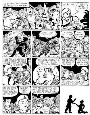
Thumbnails for p. 8 (obstructed story)

Remember that the following takes place after page 7 (don't let the immediately preceding post of page 6 fool you!):This time I actually drew at postcard size, so the images are mighty sketchy. Hence, some explanations followed by a full script.

The second tier fulfills the constraint wherein three panels must maintain a continuous image (Tom Motley described this, cinematically, as a "pan sequence"). The background may be too sketchy to make this effect plain, but the idea is that the shadow man is staggering to the right, becoming ever less shadowy, while we see all the continuous space he covers. And yes, the birdlike junkman and Kalbi do bridge panels, to reinforce the sense of movement and the passage of time as they watch the shadow man stumble.

The last panel, where Stepan and the shadow man fade into the shadow world, fulfills the constraint that one panel must lack panel borders.

Here's the text for the above panels:

Tier 1, Panel 1:
Caption: All at once, the shadowfolk all disappear with Arntham…

Tier 1, Panel 2:
Caption: All but one.
Stepan: Stay where you are!
Shadowman: Aaaa [no word balloon, just letters]


Tier 2, Panel 1:
Shadowman: Please… [wispy word balloon]

Tier 2, Panel 2:
Shadowman: …don’t trap me here… [overlapping word balloon edges]

Tier 2, Panel 3:
Shadowman: …I’m losing what I am! [normal word balloon]
Toadish Junkman: What’s happening to him?


Tier 3, Panel 1:
Stepan: I saw something similar with Arntham’s attacker. The longer I looked at him, the clearer he became…
Shadowman: Yes…

Tier 3, Panel 2:
Shadowman: This place…it hems us in…fixes us, in form, in time, in space…

Tier 3, Panel 3:
Shadowman: And Arntham’s map would do the same!
Stepan: And that’s why you tried to kill him? So he couldn’t bind your home in place?


Tier 4, Panel 1:
Kalbi: And now they’ve got him over there! They’ll kill him for good!
Stepan: Maybe not. Shadow man…

Tier 4, Panel 2:
Stepan: You’re still bound to my will. But I will release you—if you take me to your home.

Tier 4, Panel 3:
No text as Stepan and the shadowman, in the same pose as in the previous panel, become shadow figures against a blank background in a space with no borders.

***
You know the drill, gang. Comments welcome!

Sunday, October 21, 2007

Page 6, Inked

Well, after a short hiatus and a trip to SPX, I'm back in business (so to speak) and putting some ink on the page. In fact, there's kind of a lot of ink on this page. And yet, I don't think it's quite dark enough. When I look at the fields of black in my scan, there are little flecks of white all over the place. I need a new device for spotting blacks. Anyone have any recommendations? I'm trying not to use a Sharpie because they discolor over time.

Anyway, here's what happens on page 6.


I think that both of the requirements I got out of Ben Towle's constraints for these pages fit in pretty organically. It was fun to set up that end-of-the-page "reveal," in particular.

While I was inking this page, I started thinking of the junkmen as "The Chicken" and "The Egg." I wonder which one of them is named Mutt?

Anyway, let me know what you think; I'll probably ink p. 7 early next week, so please be sure to take a look at it and offer me any comments or suggestions you might have.

Saturday, October 20, 2007

Page 7, lettered

My pencils for page 7 are necesarily kind of a mess, because I'm working pretty closely from a source that I'm lightboxing, and because I'm trying to keep them pretty loose until I figure out all of the elements of the composition. (I'm still positioning a lot of debris, and the toadlike junkman's pose isn't settled yet.)

But I thought I'd post things as they are right now, because I'm planning to spend my time inking p. 6 tonight, and these digital photos of the pencilled pages seem to turn out better if I do them by daylight instead of lamplight.

Anyway, here's what I've got on p. 7. You can see that it's lettered, and (if you click to enlarge the image) you'll also see that I've revised my tentative script a little bit, mostly for the sake of naturalness. I've also spotted in a few of the darkest black areas on the page, but there will be a lot more ink in a lot of places before I'm done.


Looking at the image itself, you should be able to see Kalbi and the birdlike junkman in the top "row," fighting with barely delineated shadows, then Stepan and the toadlike junkman and finally Arntham in the lower "row." Plus lots and lots of extra lines, most of which will get cleaned up a lot in the inking process. But first I need to finish p. 6.

Let me know if you think this reads all right, or if any pencilling changes ought to be made before I set about to ink.

Tuesday, October 16, 2007

SPX Report / Owning Up to It

Things that a couple of my cartoonist friends said at different times this weekend at SPX have got me thinking. Here's a sort of disjointed essay about letting yourself enjoy things that aren't cool.

First, during the panel on “genre” in alternative comics, our pal Jon Lewis was talking about the period in one’s life when one powerfully wants to be taken seriously and therefore loudly denounces or eschews anything that’s not “serious.” Maybe this particular pupal stage is only experienced by a certain variety of nerd, but it’s definitely something I recognized in my own past personality.

At a certain point in your development, though, as Jon said, you start to feel secure enough in your own personality to allow yourself access to the unhip, the non-serious, the mainstream, and so forth. You can even enjoy some of it without irony.

I have a playlist on my iPod that I listen to sometimes on my way to work. This playlist is all ’80s pop songs that I thought were for idiots when I was in high school (and totally into the Talking Heads)—stuff like “Walking on Sunshine” or Wang Chung’s “Dance Hall Days.” They're actually really enjoyable songs. Now, my only embarrassment when I listen to them is that I was such a snob about them decades ago, when I was green in judgment. And there are certainly analogues from the world of comics.

Later, at the Ignatz afterparty, I was telling my friends from Partyka about the genre panel. There had been this moment on the panel when Gilbert Hernandez, talking about writing Birds of Prey for DC, was joking about how he’d been confused about Barbara Gordon being stuck in a wheelchair. (I’m paraphrasing here, but what he had said was something like, “You see, there was this issue of Superman where Lois Lane had a mermaid’s tail, and Superman learned how to be a surgeon so he could reattach her real legs; why can’t Superman just fix Batgirl’s legs?”) So, as I’m describing this and Shawn and Matt are chuckling, Sara Edward-Corbett goes, “You guys are such total nerds.” Or, anyway, words to that effect. I think she meant it kindly.

And I thought, you know, I’m okay with that. There are things about mainstream comics that don’t interest me one bit, and there’s a lot that I won’t bother reading, but I’m not going to deny that I have a segment of superhero “history” printed indelibly on my brain. (It’s a different segment than Gilbert Hernandez’s, I’m sure, but if anyone needs me to describe Kirby’s run on Kamandi or, God help me, the first dozen issues of Alpha Flight, I can probably do it.)

Come to think of it, I consider it kind of a compliment that one of my cartoonist friends asked me to remind him what Metron’s chair looks like, for a sketch he was doing this weekend.

I’m not even going to disallow the possibility that some unhip, mainstream stuff currently being printed would turn out to be enjoyable. I liked the first six issues of the Waid / Perez Brave and the Bold, for example. I can admit that.

Anyway, all of this has led me to think about why it is that I enjoyed this year’s SPX more than I did last year’s. I think it’s mostly because this year I took it a lot less seriously. I mean, I was a little nervous about the panel I moderated, and I was glad that it went well. I was honored to be the one to introduce Bill Griffith’s lecture. But on the show floor I was neither concerned about being cool nor worried at all about selling Satisfactory Comics. (I gave out a lot of postcards, and traded quite a few copies of #7, but I didn’t sell a single comic.) Basically, I was treating the convention floor as what it is, for me: a venue where I can pursue my minicomics hobby.


Also, I have a couple of notebooks that I’ve slowly been filling with sketches by other cartoonists, one book with monkeys and the other with robots. It’s a fanboy thing to do, and I recognize that; showing the books to someone always makes me feel uncomfortably geeky, and I feel like a dork when I ask someone to do a sketch for me. But I think I can admit to myself that the sketchbooks make me happy. The drawings (some by famous cartoonists and some by friends) are souvenirs, more than a collection, and a lot of them really do put a smile on my face.

Last year at SPX I asked Tony Millionaire to draw the frontispiece in my monkey sketchbook. This year, back toward the back of the book, Gilbert Hernandez:

I don’t think I should feel embarrassed to have asked for that.

Sunday, October 14, 2007

MW meets MW at SPX

Just a quick note, an aside from the would-be Elfworld-proceedings:

This past weekend the Small Press Expo (SPX) took place in Bethesda, Maryland, not far from where I live now. I enjoyed visiting with friends and cartoonists who came down for the convention, including occasional SatCom collaborators Shawn Cheng, Tom K, Bill Kartalopoulos, Jon Lewis, Karen Sneider, and Ben Towle, not to mention my buddy Isaac himself. Smart and generous minicomics artists were in full effect!

But I also enjoyed the chance to talk for a while with some major artists of the reg'lar-sized comics variety, notably Gilbert Hernandez of Love and Rockets fame and Matt Wagner of Mage, Grendel, and assorted DC Comics fame. For a while now I have felt that I might not have stopped reading comics for ten years if the proprietors of my hometown nerd store had seen fit to recommend titles like L&R, Hate, and Eightball when I began to grow restless with Detective; my introduction to Beto's work was sadly belated. But at least I was reading Matt Wagner's work back then, and I think it has had a greater influence on my cartooning than I usually recognize.

My enthusiasm for Grendel was shared with my high-school pal David, and probably it was our short-lived effort to tell our own Grendel story that shifted my cartooning ambitions from comic strips to comic books (in the long run, a smart move for this cartoon hobbyist, as the outlets for amateur minicomics seem more accessible to me than those for amateur comic strips—at least since I won't be launching any comic-strip websites). In fact, David inked my pencils before Isaac ever did, though no more than a single page of Grendel accosting the reader with a plea to "Bring back the Primer"—Comico's erstwhile showcase for fledgling cartoonists, where Wagner himself launched Grendel twenty-five years ago.

Which brings me back to this weekend. Wagner attended SPX in part to promote a silver-anniversary book dedicated to the art of Grendel, and that gave me the chance to thank him, fanboyishly, for the stirring example of his comics on my impressionable young mind. And one of the impressions that Wagner made, even back then, was that steady work can improve one's skills dramatically. Compare the first few issues of Mage with the last, and you'll see a quick development in Wagner's confidence and command. He addresses this himself in the last paragraphs of the introduction to his newly-published Grendel Archives, containing the first few stories of his flagship antihero:
It is my sincerest wish that readers will find a certain inspiration in these pages and come to feel, as I do, that they stand as a true testament to the powerful potential of the creative spirit. Despite any negative response I might have encountered in the press, my own primal urge to express myself in this medium led my efforts onward and upward. I knew that if I opened my mind both to criticism and to craftsmanship, it would lead me to new perspectives and enable me to further develop my skills. It is in the act of making art that one truly becomes an artist.

If I could do it, so can you.

Never falter and never look back.


Except to regard how far you’ve come.
If Wagner comes off as slightly pretentious toward the end, there, I'm prepared to cut him some slack: tone can be hard to manage in prose, and by his own admission he's not great at writing ("—or at art; I'm great at putting them together," to quote him from a panel yesterday afternoon). In person, Wagner impressed me with his easy affability and lack of self-importance. If I have any quibbles with his encouraging declaration that the way to become an artist is simply to make art, it's that he throws up another roadblock when he says "[n]ever falter and never look back." I think that Isaac and I have both learned a lot from our errors and failures along the way, and we've learned from them in part by gritting our teeth and looking back at them, in all their embarrassing clumsiness. Not all of the useful criticism of our work has come from outside, after all. That said, Wagner's surely right that one shouldn't dwell overmuch on past shortcomings—not when there are still more comics to be made.

And on that note, I will next post when I have some thumbnails to share for page 8 of Stepan's story!

Tuesday, October 9, 2007

Script (Tentative) for p. 7

I was going to email this to Mike, but then I realized that I might as well release it for general kibitzing. I'm going to forego the thumbnails for the single big panel that is p. 7, and jump right into the pencils, for reasons that will become clear. The text in the page is all in captions that sort of slide down the page, sometimes askew, Joe Sacco-style.

Here's the script. Each paragraph is a new caption.

QUICKLY—ALMOST BEFORE I
CAN THINK—EVERYTHING
BECOMES A CHAOTIC BLUR.

WE'RE OUTNUMBERED, BUT I
CAN'T SEE HOW MANY OF THE
SHADOWS ARE OUT THERE.

THE JUNKMEN HANDLE THEMSELVES WELL—
TOSSING SWORD-BLOWS AND KICKS OF ALL KINDS.

BUT THE SHADOWS
KEEP CLOSING IN.

I'M TRYING TO
CAST A SPELL—

BUT I DON'T HAVE
MANY THINGS AT HAND.

QUICK—

WHAT IS THE ESSENTIAL
NATURE OF A SALTCELLAR?

—OF A WHEEL?

—OF A GREEN BOX?

—OF REINS?

EUREKA!

I GRAB THE REINS AND USE
THEM TO BIND ONE OF THE
SHADOWS TO MY WILL.

BUT I'M TOO LATE.

DESPITE OUR EFFORTS, TWO
SHADOWS GRAB ARNTHAM
AND HIS MAP—

—AND ABDUCT HIM INTO
THEIR INVISIBLE WORLD.

Now, at least, Mike knows what happens on p. 7, so he can start planning p. 8. And I'm packing in a lot more than three Duchamp references for Tom: the phrase "kicks of all kinds" is from a Duchamp title, as is "Green Box"; also, Duchamp apparently sometimes referred to himself as "the Salt-Seller" (Marcel Duchamp = Marchand du sel), so there's a pun in another one of my random objects...

... and there will be more references, at the visual level, for which you'll have to wait.

Sunday, October 7, 2007

Tom Motley's Constraints to Us (pp. 7-8)

I've been sitting on these for a few days, so they wouldn't get in too far ahead of our completion of the preceding two pages, but I think the time has come to post them. These are the fiendish constraints created for our next two pages by our friend and frequent collaborator Tom Motley.

"These are simple, maybe even mundane," he says. "But when you put them together, they could be tricky. The pages so far are feeling a bit compressed, so let's let some air in...

"1. One of the two pages must be a single full page panel.

"2. At least one of the other panels must have no borders.

"3. At least one panel must have pictures instead of words in the speech or thought balloons.

"4. Three panels must link together to form a pan sequence (a continuous background chopped into panels). These panels needn't be adjacent.

"5. There must be three or more subtle allusions to the work of Marcel Duchamp."

Oh, he says they're simple, but in fact they combine in some pretty devious ways. Notice that if I choose #1 for my page (p. 7), I can't use #2 or #4, so I have to leave those for Mike, and I have to take #3 and #5 for myself. One choice is all I get!

I'd have a tiny bit more freedom if I took #2 and #4 for myself—I could choose which of #3 or #5 to foist on Mike—but I've got a plan for how to work the other combination.

...And if you look at my pencils for p. 6, you'll see that I've already built in a couple of allusions to Duchamp that I'll only have to repeat visually on p. 7. By the way, I have some really rough thumbnails for that one already, but I think I'm just going to jump to the pencils in my posts.

Page 5, inked

Well, it's been three full weeks since Isaac posted the last finished page, but here at long last is page 5, more or less finished (you may click the image to enlarge it):

A couple of corrections are in order (stray or wobbly lines here and there, and I still need to suggest the "ring for service" label on the countertop sign in the first two panels). And having just seen a prime version of "the Bagge" by Peter Bagge himself, in the latest issue of Apocalypse Nerd, I am well aware that my distorted version of John the constable in panel 2 is woefully pedestrian. Sorry, Ben! Still, this version should suffice until the final clean-up before publication.

And really, we are planning to finish this, and not too far off our notional schedule, either. Isaac and I have both had a couple of very busy weeks, and this comics-making activity of ours is strictly extracurricular. But Isaac wisely factored in an extra week in our schedule when we started back in August, and now that the fall Jewish holidays are over I have a lot more working hours per week again—so I should be able to get things back on track once I see what's happening with page 7. (Wishful thinking? Wish me luck!)

But before we get there, Isaac's got to finish page 6—so I'll jump back to his just-posted pencils of that page to see if I can offer any useful comment. ("You come, too!" as Frost might have said, were he a blogging cartoonist...)

Page 6 pencils (obstructed story)

Well, I have some pencils done for p. 6 of that Elfworld submission now. I have already made one change since drawing this: the label on the side of the coach is going to end with "SALVAGE" and not with "JUNKERY."

There are going to be a lot of spot blacks in this page, because it's set outside in the dark. If you see a little "x" floating in an otherwise empty field, that means the whole field will be black. (Probably I don't have to explain that convention to most of you reading this, but who knows? I want to be reader-friendly, even for the uninitiated.)


Please click on that image to make it legible, then let me have any critiques or suggestions you can come up with. I want to start lettering the page some time late today or early tomorrow, so I'll really appreciate speedy comments.