Showing posts with label Elfworld top layer. Show all posts

Friday, June 6, 2008

Satisfactory Comics #8 (June 2008)

At long last, I am happy to offer you a way to buy the story that Mike and I were working on all last fall and winter, now in full color and easily portable:


This story will debut at the MoCCA Festival this weekend, and after the convention it may turn out to be in short supply, but I can always print more if I need to.

We've dubbed this story "Stepan Crick and the Chart of the Possible," and we're also calling it Satisfactory Comics #8. At ten pages, it might seem short for an issue of Satisfactory, but they're dense pages, and I think it's really the best story we've told yet.

As you can see, that tidy little packet contains a lot of color and a lot of incident:


(You can click that to enlarge it.)

For more information about the story -- for all of its elaborate constraints and conditions, for the alternatives we considered, for the thumbnails and the pencils, and, indeed, for the black-and-white version of each page in turn -- you can read the posts in this category in reverse order. But wouldn't it be more fun to read it in your hands instead of here in your web browser?

This version of the story comes on ten unbound postcards, each of them ready to read or to send.

Yes, we've left room for your message on the reverse of the postcard: if you buy a set to send to a friend, you'll also be able to put in some correspondence. (I recommend spacing them out, about a week apart. The end of each page is designed as a point of narrative suspense, so the reader who receives the cards slowly should get plenty of twists and surprises. If you've got several friends and you'd like to order several sets, please read the post on ordering multiple comics.)


As I said, the cards are in full color. I think they've really turned out nicely. They come wrapped in a little band (printed in two colors and sealed with a sticker of one of the characters from the story -- not necessarily this guy).


UPDATE (NOVEMBER 2012):
I'm afraid that this issue is, at least temporarily sold out. You can still read the comic (in black and white) here on the blog, but for now all the in-print copies of SC8 belong to other people.

Sunday, December 23, 2007

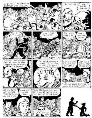
Page 10, Inked

Getting through the end of the semester is never easy, but I always try to submit my grades on the same day that I give my last exam, so I can get back into the other things I always have to neglect at the end of the term. (For example, there's the MLA paper on Chris Ware and "the grammar of diagrams" that I'm delivering on Thursday; I still need to write that.)

But now that I've had a couple of days to recover from the end-of-term grading marathon, I have been able to put a few minutes into redrawing Ipthorin in one panel, then a couple of hours into inking the page. It's not the best cartooning I've ever done, but it is finished (I think), which is what matters.

Please, I beg of you, click on this image to see how our story ends.

I invite you to notice that I have not merely satisfied Jesse's remaining two constraints—as long as you count the middle of the second tier as a panel, it's the third silent panel in a row; the third panel on that row is mostly swiped from Jesse's recent and awesome Bluefuzz minicomic. Not merely, indeed, for I have also chosen two constraints from each of the preceding four sets of constraints and nodded to these in individual panels: the Corrigan and the Reverse Corrigan; the shop-sign and the Passion of Joan of Arc; the Ditko and the Segar (also a little nod to the J. Chris Campbell in the transition to the last panel); a borderless panel and a reference to Duchamp; even (why not) a panel of pure silhouette. You can see signs of me planning this stunt on one of the thumbnail pages I posted back in November. I'm surprised no one commented on that.

We're planning to leave the whole story up on the website for a little bit longer, but we'll pull most of it down when we start coloring the pages and printing them as postcards. When that happens, you'll have the option to buy a copy of the story, either all at once in a single envelope, or serialized to you (or the recipient of your choice) in the mail one page per week.

Meanwhile, please enjoy it in black and white for free, while it's here. I encourage you to use the comments section to discuss overarching themes in the story. For example: what view does this story take of potentiality and the realization of a single potential? What does that imply about the authors' apparent unwillingness to "grow up"?

Friday, November 30, 2007

Page 9, inked

All right, folks, we're getting down to the wire—but there's my last page for our Elfworld submission, right there!

Constraints: Silhouettes in every panel? Check!—even if they're tiny in panel 6. Overheard dialogue? Check!—even if it isn't very colorful ("What's going on here?"). Something concealed? Check!—as implied in the final caption of the page.

My work as a cartoonist is done here. Now I just get to enjoy my work as a kibitzer. Isaac: bring it on home with page 10!

Thursday, November 8, 2007

Jesse Reklaw's Constraints to Us (pp. 9-10)

Matt Madden unfortunately had to bow out from writing our last five constraints for this story, because he has a lot of other things going on for the next couple of weeks, and we're feeling uncharacteristically uptight about our deadlines. He suggested that we contact our friend and comics guru* Jesse Reklaw as a backup, and Jesse was good enough to provide us with a few fairly challenging rules for the home stretch of our story.

Here's what he's going to require us to do:

"1. Silhouettes. Incorporate a silhouette into every panel on the page. By silhouette, I mean either a solid black shape on white ground, or a solid white shape on black ground. The silhouette could be the foreground, middle ground, or background. If you want, you could use silhouettes in half the panels on the first page, and half the panels on the second page—in fact, I think that might look better. But it's your choice.

"2. Found art. The picture in one panel must be from a found source—drawn or photographed by someone else.

"3. Concealment. Something must be concealed on the first page that is revealed on the second page. Whoever goes first can't tell the other what is concealed! (So, the "revealer" might be revealing something that wasn't necessarily concealed by the "concealer.")

"4. Found dialog. An exchange of dialog overheard in real life must be incorporated into the story.

"5. Wordless. A sequence of at least three panels must use no words: no captions, dialog, thought balloons, etc. You can have signage in the background, though that's slightly cheating."

He adds this, as a postscript: "I tried to think of something involving a map, since that's what the story's about, but I couldn't. I just kept thinking of that great example in Matt's Exercises in Style where the comic is actually a map. Maybe you could reference that comic, as a bonus constraint, and as a salute to Matt, since he was your intended constrainer."

Those are some pretty good constraints: tough without being impossible. I think I can see a way to reference Matt's map-comic on p. 10, and I imagine Mike can see a way to satisfy the first constraint on p. 9. Expect to see some thumbnail sketches for the last two pages soon! Mike's up first.


*Seriously, some time I mean to make a post about how influential and inspirational Jesse was in our early decisions about making minicomics. I've got a lot to say about it. But this isn't the post for that.

Monday, October 29, 2007

Page 8, inked

Hey, this time I used my image-correcting brightness controls in "post-production" to make the spot blacks look really black for a change! (My inks were looking a little feeble compared with Isaac's.) Yay, technology! Improvements at the push of a button!

Alas, other improvements were more laborious. Tier three, panel 1 is mostly redesigned away from the pencils I first posted, and I had to bust out some Pro White to add the magical "reins" in tier two, panel 2, where I had stupidly omitted them at first.

But never mind all that! A page is a page, and this one follows close on the heels of Isaac's page 7. We're closing in on the end. Will we make it? Only time—and Matt Madden, our next constrainer—will tell!

Saturday, October 27, 2007

Page 7, Inked

I had a cloudy bunch of pencils for page seven before I left town for SPX, and I'm only now, a couple of weeks later, done with the inks. But I've had a very busy couple of weeks.

The good news is that we've just got three pages to go. (The bad news, of course, is that we have to wrap up the story somehow in those three pages and still satisfy our final set of constraints.)

Here's the way page seven seems to have turned out. Please click on the picture to enlarge it to legible size.

That kick to the jaw, by the way, is totally dedicated to Chris Sims of the Invincible Super-Blog.

You may also wish to compare the thumbnail of p. 7 with this slightly distorted version of Marcel Duchamp's most famous painting, Nude Descending a Staircase.


This version of Nude Descending is wider than the original, so that I could put it under my page and lightbox the layout of the painting directly. In fact, I was still doing that when I had inked every one of the figures on the page, to get little areas of light and dark to "match up," not that it matters. Not very much of the original comes through, in the end, but I hope that some of the kinetic, multiplanar chaos carries over. When I color this image, I'll try to stick to a yellowy earthtone palette, which should help make the swipe more noticeable. (That will probably also make the captions easier to find in amid all those lines.)

I have to say, it was fun to draw the figures a little larger this time.

Sunday, October 21, 2007

Page 6, Inked

Well, after a short hiatus and a trip to SPX, I'm back in business (so to speak) and putting some ink on the page. In fact, there's kind of a lot of ink on this page. And yet, I don't think it's quite dark enough. When I look at the fields of black in my scan, there are little flecks of white all over the place. I need a new device for spotting blacks. Anyone have any recommendations? I'm trying not to use a Sharpie because they discolor over time.

Anyway, here's what happens on page 6.


I think that both of the requirements I got out of Ben Towle's constraints for these pages fit in pretty organically. It was fun to set up that end-of-the-page "reveal," in particular.

While I was inking this page, I started thinking of the junkmen as "The Chicken" and "The Egg." I wonder which one of them is named Mutt?

Anyway, let me know what you think; I'll probably ink p. 7 early next week, so please be sure to take a look at it and offer me any comments or suggestions you might have.

Sunday, October 7, 2007

Tom Motley's Constraints to Us (pp. 7-8)

I've been sitting on these for a few days, so they wouldn't get in too far ahead of our completion of the preceding two pages, but I think the time has come to post them. These are the fiendish constraints created for our next two pages by our friend and frequent collaborator Tom Motley.

"These are simple, maybe even mundane," he says. "But when you put them together, they could be tricky. The pages so far are feeling a bit compressed, so let's let some air in...

"1. One of the two pages must be a single full page panel.

"2. At least one of the other panels must have no borders.

"3. At least one panel must have pictures instead of words in the speech or thought balloons.

"4. Three panels must link together to form a pan sequence (a continuous background chopped into panels). These panels needn't be adjacent.

"5. There must be three or more subtle allusions to the work of Marcel Duchamp."

Oh, he says they're simple, but in fact they combine in some pretty devious ways. Notice that if I choose #1 for my page (p. 7), I can't use #2 or #4, so I have to leave those for Mike, and I have to take #3 and #5 for myself. One choice is all I get!

I'd have a tiny bit more freedom if I took #2 and #4 for myself—I could choose which of #3 or #5 to foist on Mike—but I've got a plan for how to work the other combination.

...And if you look at my pencils for p. 6, you'll see that I've already built in a couple of allusions to Duchamp that I'll only have to repeat visually on p. 7. By the way, I have some really rough thumbnails for that one already, but I think I'm just going to jump to the pencils in my posts.

Page 5, inked

Well, it's been three full weeks since Isaac posted the last finished page, but here at long last is page 5, more or less finished (you may click the image to enlarge it):

A couple of corrections are in order (stray or wobbly lines here and there, and I still need to suggest the "ring for service" label on the countertop sign in the first two panels). And having just seen a prime version of "the Bagge" by Peter Bagge himself, in the latest issue of Apocalypse Nerd, I am well aware that my distorted version of John the constable in panel 2 is woefully pedestrian. Sorry, Ben! Still, this version should suffice until the final clean-up before publication.

And really, we are planning to finish this, and not too far off our notional schedule, either. Isaac and I have both had a couple of very busy weeks, and this comics-making activity of ours is strictly extracurricular. But Isaac wisely factored in an extra week in our schedule when we started back in August, and now that the fall Jewish holidays are over I have a lot more working hours per week again—so I should be able to get things back on track once I see what's happening with page 7. (Wishful thinking? Wish me luck!)

But before we get there, Isaac's got to finish page 6—so I'll jump back to his just-posted pencils of that page to see if I can offer any useful comment. ("You come, too!" as Frost might have said, were he a blogging cartoonist...)

Sunday, September 16, 2007

Page 4, inked

Okay. Here's the inked version of page 4. I wound up cross-hatching a lot on this one, maybe more than I ought to have. I wanted to make the shop (and the alley) look a little gloomy. Plus, cross-hatching was one way to make the signs drop into the background even on the black-and-white version of the story. (You'll notice that I also broke the letterforms a lot, which will hopefully make the signs read less like captions or speech balloons, even though they're mostly in my lettering hand.)

Notable changes from the pencils are few (except for the shading): mostly I just firmed up a few places where I'd left the pencils a little loose. I made one mistake with the orientation of Kalbi's dewclaw (in panel 3) and had to erase the mistake in Photoshop. Hopefully that's not noticeable.

You can, as usual, see a bigger version of this if you click on it:


That bigger version will appear at larger-than-postcard size, but believe me that it has 70% of the information (pixels) that the actual postcard will have—so it ought to be a good gauge of legibility, even at a slightly larger size.

Now let's see where Mike goes with page five!

Friday, September 14, 2007

Ben Towle's Constraints to Us (pp. 5-6)

Well, I know that some people are really itching to see Ben Towle's constraints for our in-progress Elfworld submission, so I'm going to go ahead and post them. Page 4 is all lettered now, and I'm planning to get the inks finished on Sunday. I'll post that page as soon as it's scanned. Meanwhile, please enjoy contemplating the direction of the story with these constraints in place.

Ben said, "Looking over the constraints up to this point, I found myself laughing out loud at 'The Corrigan,' mainly because I kept hearing it in my head as if it were being pronounced by a sports announcer narrating a past sporting event—as in, 'the catcher has signaled The Corrigan, but the pitcher shakes it off...'

"Anyway, I wandered over to my book shelf and grabbed some comics that I like and decided to isolate some formal element from each of them that I liked and make each of those a constraint. Although I've listed them as 'The xxxx,' none of these things are unique to any of these cartoonists, nor necessarily 'signature moves' from each.

"They're all formal, but hopefully they'll have a significant enough effect on the process that they'll have narrative effect as well."

And here are his constraints:

1. The Ditko: At least one panel must prominently feature a literal drawing of a character’s hands as well as some sort of non-literal graphic representation of something: a spell being cast, a change in psychological state, emanata of some sort, etc.


The Bagge: At some point a character must be drawn off-model in order to convey his or her emotional or psychological state.


The Langridge: At least one panel must be round and without text or dialog of any sort. Bonus points if it’s serving as in “peek-a-boo” panel as in the first item from the example.


The J. Chris Campbell: Somewhere, a change in the amount of visual background or setting included in the final panel of a sequence must serve as a “reveal” in the narrative.


The Segar: Include somewhere, some element of self-reference to some formal element of the comics art form.


(Also recently spotted in Pearls Before Swine)


So: there they are. Mike will be drawing p. 5. I'm really curious to see which of these five he'll be leaving me with.

Sunday, September 9, 2007

Page 3, inked

Whew! Well, now we're back on schedule (and I have good evidence of how much better is it to stay on it in the first place). Here's page 3:

There are two stray lines that need a dose of Wite-Out, one at the top of the first close-up of Kalbi and one at the left of the panel with the door in the beam. The second of these looks like a violation of Tom's constraint about the grid, but it's not really, because it's a boo-boo. At any rate, once those are gone and I've tidied up one other little Rapidograph smudge, this page should be ready for a high-res scan to send to Isaac for coloring.

I want to thank all those who made comments to help me revise this page to its present shape. I'm a lot happier with the new design than I was with the design in the first thumbnail. And after 21 panels in a four-tier grid, I think it's refreshing to see a different layout. So thanks as well to Tom Hart, for providing the constraint that forced me to think outside of the boxes!

But please don't let this just-posted page distract you from Isaac's preceding post, featuring his thumbnails for page 4. I'm sure he'll be wanting your comments on those, so click back and let him know what you think!

Friday, September 7, 2007

Page 2, inked

Well, I got the second page of our constrained fantasy story done four and a half days late. While that seems to bode ill for our schedule (and it's All My Bad), I'm hellbent on catching up on page three over the next three days, to make sure that Isaac isn't delayed on my account.

Somehow, I managed to squeeze in even more panels than master miniaturist Isaac. Check it out:

A couple notes:

While basically finished, the page needs a few tweaks before it's printed. I forgot to make the tail of Arntham's word-balloon wiggly in the first panel, and I need to remove the ink smudges on the caption in panel 9 (evidence that I'm still a novice at using a Rapidograph with a ruler!).

I also wonder if the first tier, which looks a little bare, needs some real backgrounds for the bazaar ambience. I'm hoping that Isaac provided enough of that on page 1 that the effect will sort of carry over to these panels.

As for the constraints, to satisfy "the Corrigan" I had to avoid showing any character's face other than Stepan's. That actually worked to my advantage with the mysterious assailant and the dark figure in the doorway—I want these two to look, at least momentarily, like one. For the "entrances and exits" constraint, I was glad I took Isaac's advice to compress the storytelling in the first tier so as to win more room later on; I think it's a lot clearer now that there's an exit in panel 10 and an entrance in panel 11.

Finally, a comment on Ipthorin's toponym. "Wynholm" is a shout-out to Diana Wynne Jones, author of such fantasy novels as Howl's Moving Castle (source for the Miyazaki film) and Dark Lord of Derkholm ("Wynne" + "Derkholm" = "Wynholm," which can be construed as "islet of joy"). The latter novel grew out of another of her projects, the indispensable Tough Guide to Fantasyland, an A-to-Z guide to the conventions and clichés of fantasy literature. And sure enough, we've already invoked several, in this project and in the Mapjam. And I'm sure there are more to come...

Anyway, no time to rest on my inky laurels. I've got to get back to page 3!

Wednesday, September 5, 2007

Tom Hart's constraints to us (pp. 3 & 4)

I've already mentioned three of these in passing, but here in one place for ease of reference are the five constraints that Tom (Hutch Owen) Hart sent us for pages 3 and 4:

1. AS ABOVE, SO BELOW: This is one constraint. The page must feature a levitation and a burial.

2. A DISGUISE REVEALED: A disguise must be revealed—to the audience or the main character. (A light inspiration from The Seventh Seal)

3. SAY NO TO THE GRID: No two panels can be on the same X or Y axis. Each border of each panel must exist in its own unique relation to the edges of the page. Circular panels cannot have the same center on any axis. Trapezoids cannont share a continued line.

4. SIGNS AND LABELS: Each panel has to feature a sign advertising a product, service or the like, or a label doing the same.

5. THE PASSION OF JOAN OF ARC: All close-ups (of the subject of the panel, whether human or not) and no transition between two panels can feature a common element. ("The kind of storytelling I berate my students for!" says Tom.)

As Isaac noted, some of these constraints would make for tricky storytelling if found on the same page (for example, pairing numbers 4 and 5). I tried to be mindful of this when I left him with "A disguise revealed" and "Signs and labels"—which is not to say that the combinations we are working with don't offer their own brainteasers.

Finally, I like that Tom's constraints offer a mix of pure comics formalism (items 3–5) and specific narrative instructions (items 1–2). I made sure Isaac got one of each kind for page 4.

Sunday, August 26, 2007

Page 1, Inked

Well, I got the first page of our constrained fantasy story done within the one-week deadline. I think the story's off to an interesting start, and I hope that I've suggested an interesting world with all of these passersby in the Bazaar.

I'll try to color this image before long, but the coloring can lag behind schedule a little bit, as long as we get the inks done on time. (Only the black-and-white pages will be submitted to Elfworld.)

Here are my results. You can click to enlarge the image. I've deliberately saved it at postcard size (at least for my monitor), so all of you can't-fit-that-on-a-postcard naysayers can judge whether the four-tier plan worked out. (The postcards will be printed at better resolution than a laptop monitor, though, so they should be more legible.)

I'm pretty happy with the way I responded to two of the constraints. Stepan, our protagonist, definitely spends most of this page as an "audience" to the little scenes around him, and the seven ages of man are represented in seven equal-sized panels that hew pretty closely to the types mentioned in Jacques's famous speech: the infant, the schoolboy, the lover, the soldlier, the justice, the pantaloon, and the shriveled old man. I like the way that Charles's constraints suggested a macguffin for this story: I sent Stepan looking for a very old man, because the old man was at the end of Jacques's speech.

I'm not as happy with the way I responded to the "Reverse Corrigan" constraint, to tell you the truth. It wasn't until I had inked about half of the page that I realized that Charles wanted every character's facial expression visible (except for the protagonist's). I think there are five or six people in the backgrounds and margins whose faces can't be seen—or maybe even more than that. If you like, you can think of them as props or set-dressing, instead of characters, but that's sort of a lame excuse. Sorry, Charles—I messed up (but only a little).

I now pass the baton to Mike, who has to continue the story and satisfy the remaining two constraints. Good luck, buddy!

Monday, August 20, 2007

Charles Hatfield's Constraints to Us (p. 1 and 2)

This morning, we got constraints from our comics-scholar colleague and friend Charles Hatfield. (He's the author of Alternative Comics: An Emerging Literature, for sure one of the best critical books about graphic novels.)

Here are his obstructions to us, the ones that will shape the first two weeks of our new project:

1. All the world’s a stage: The sequence in these two pages must include onlookers to the main action – that is, an audience, whether seen or implied – so as to involve, if only implicitly, the idea of spectatorship. (The audience may be us, addressed directly, or it may be secondary characters within the diegesis, but, either way, we should become aware of audience.)

2. They have their exits and their entrances: The sequence must involve dialogue and interaction among multiple characters, with at least one character making an entrance during the sequence and at least one character making an exit.

3. The ages of man: Characters of several distinctly different ages, spanning from early childhood to old age, must be present in the sequence.

4. A Corrigan: One page of the sequence (which, again, is to feature dialogue and interaction among multiple characters) should be composed so that the faces of all the characters except the protagonist are obscured from view. That is, the images should be drawn/designed in such a way as to hide from sight the expressions of every character except that character you designate as the “main” character.

5. A Reverse Corrigan: In the opposite page of the sequence, the face of the protagonist, and only that of the protagonist, must be obscured from view. That is, the images should be composed so as to hide the “main” character’s expressions from sight, while revealing every other character’s expression.


I have to revise one thing slightly about Charles's first three obstructions: it's our intention that in each set of two pages (one drawn by each of us), the first page will "claim" three of the five obstructions, and the second will tackle the two that the first page didn't handle. So: we'll have onlookers, entrances, exits, and the seven ages of man in this two-page sequence, but it's possible that each of those things will appear in only one of the two pages.

I'm going first, and I've already had some ideas about how to satisfy the constraints. Believe it or not, I've already changed my mind at least once about which three I'll use. I have a week to finish this page, so I'm going to try to bang out some thumbnails (and post them) as soon as possible. You'll hear more from me soon.