But there were other extra features I've always appreciated, and among these are "our two 'swipes'—one from museum art..., and one from comics we like." I acknowledge that such a bald distinction between what some call "high" and "low" art deserves at least some resistance if not outright challenge—especially after Isaac and I enjoyed and admired the remarkable Masters of American Comics exhibit on display in two museums in New York and Newark a few months back. Still, it's a handy enough distinction, and I'd like to discuss the fine art swipes from Satisfactory Comics #2 before I proceed to its comics swipes.
And yes, the swipes are multiple in the second issue—partly because this issue featured two stories, each of which had a claim to two swipes of its own, and partly because we couldn't help ourselves. I'm not sure if we've yet learned to "kill our darlings" in sufficient quantity, though again the latest issue seems to have dispensed with the swipe from museum art (unless Isaac has hidden one from me!). In the first story we drew, "Turkish Delight," our heroine Yeliz has to put up with a verse-quoting blowhard who recites Byron while admiring a surge in the Bosp(h)orus:
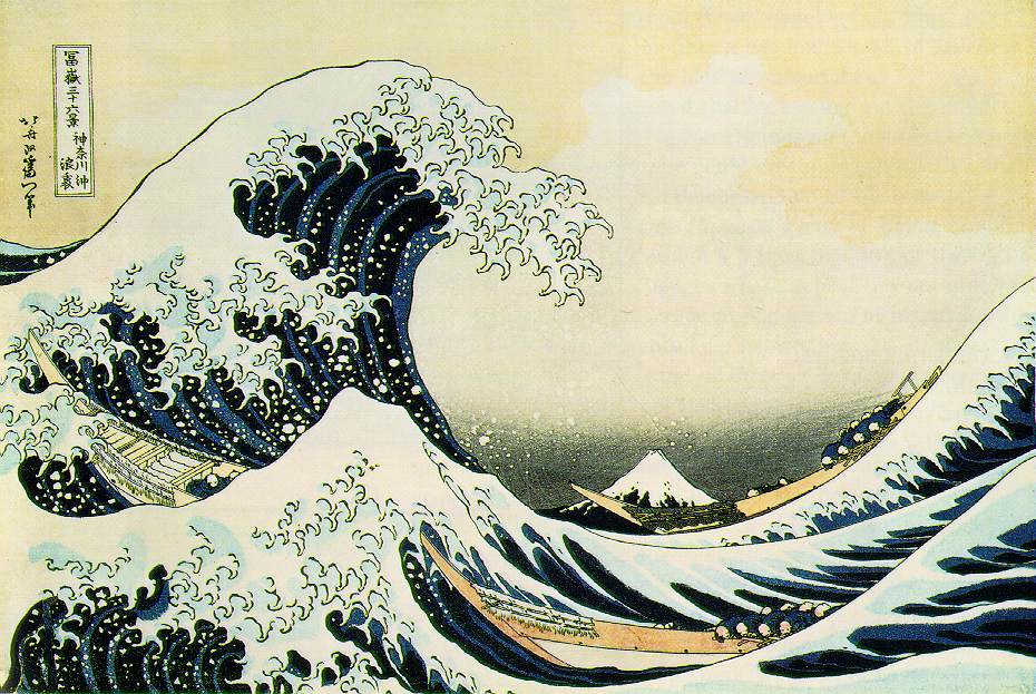
 Evidently, Hokusai's Great Wave has travelled the globe from Japan to Turkey:
Hokusai's work blurs the Western categories of "museum art" and "comics," given that much of his output consisted of mass-produced line art with flat colors, and he has even been claimed as a progenitor of Japan's modern mangaka (a claim helped by the name he gave to a series of sketchbooks: Hokusai manga). But Hokusai was also a gifted (like, insanely talented) painter—after seeing a fairly comprehensive exhibit last summer featuring his work in paint and in prints, I esteem him even more highly now than I did when we swiped what is probably his best-known work five years ago.
Another familiar painting crops up in the other story of this issue, "Getting Over Laura." Quick, name the source for this image:
 If you named The Adventures of Baron Munchausen, you're half right!
Uma Thurman As Venus - Funny blooper videos are here
...but, of course, director Terry Gilliam was himself swiping Botticelli's Birth of Venus:

You may have noticed that Isaac added a scarf to his drawing of Venus, a bit of drapery that proves crucial to tying together the two stories in that issue. So here the swipe actually plays an important narrative role.
By contrast, the last fine art swipe in issue 2 is sheer background decoration, and so tiny as to be nigh unrecognizable:

But since Klimt's The Kiss is so iconic, you may have recognized it right off, too:

I'm personally pleased that Isaac put this painting on the wall of Yeliz's apartment because I once boarded in the home of a remarkable woman who decorated the walls with her own paintings, one of which also swiped an image from a different Klimt piece. I think she decided I would be a suitable boarder when I recognized the artist she had swiped from!
Next up: the comics swipes from issue 2...

2 comments:
I might also point out that our mercantile post about Satisfactory Comics #2 features two of those swipes in their original contexts. Click on over, and you can see how tiny the little Klimt swipe is, and you can see Venus in the larger context of Rob's dream.
The Klimt swipe may be small, but it is also too large for the space it occupies on Yeliz's wall. It overfills the gap between the oval portraits (surely old photos of her parents), almost violently so. In effect, the three together form another "face" (one more intrusive than mine) gazing down at Yeliz and her lonely evening from the other side.
Until reading this post I did not recognize the middle image as a Klimt swipe, but knowing what it is really deepens my appreciation of Yeliz's plight and her desire to alter it. That knowledge somehow also deepens my appreciation for Klimt's painting.
Long live the swipe.
Post a Comment