My other belated "K" entry for
Alphabooks takes us away to the desert Southwest, to the precinct of Kokonino, in the same neck of the woods as Monument Valley and the
Elephant's Legs (or Feet).
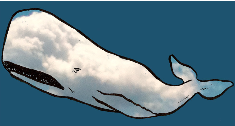
Once I got it into my head to draw a character from
Krazy Kat for the letter K, I couldn't limit myself to just one. For the record, the busybody duck, Mrs. Katalpa Kwakk-Wakk, was the first to occur to me, but she's not the only Kokonino denizen to sport those initials. There's also the brickmaker Kolin Kelly, and of course Krazy him/herself, and his/her erstwhile love interest, the sensational character find of
1930, Kiskidee Kuku. (He's a poodle.)
Kiskidee Kuku's appearance in Kokonino unsettles the natural order of things. Offissa Pupp and Ignatz Mouse are on the outs with Krazy, no bricks get tossed, the jail remains untenanted, and eventually pretty much everyone just up and leaves town. Over the span of several Sundays, things go wobbly, then (of course) everything settles back down again.
Anyway, there's a picture of the problem jauntily trotting into Kokonino.
I tried to keep the colors in my drawing close to a duotone print, because I don't really think of
Krazy as happening in color, despite the splendor of Southwestern geology and the fact that the Sunday
Krazys were in color for years.
I "get" Herriman's doodles about as well as I get Trondheim's character designs (I can fake Herriman's backgrounds all right, and I can do a passable Ignatz from memory), though I wasn't sure about replicating them with a brush instead of a nib.
And let's face it: drawing Krazy Kat is like forging someone's signature. Herriman drew all of these characters as doodles, really, and if you draw the same doodle several times a day for decades, it's going to pick up some personal idiosyncrasy.
I hope I have at least rendered Krazy &c recognizably. Please let me know what you think.
Now, if you are a purist and don't consider Krazy and her compeers to be "characters from a book," I have two things to say to you:
First, although they were designed for a more ephemeral medium,
I know them from books. It's true that I saw Krazy in the local free weekly, or maybe the
Daily Texan, while I was an undergrad, but I knew her/him first from
the collection edited my Patrick McDonnell and others and from the
weird novel by Jay Cantor. And my love for Krazy has only been extenuated and enriched by the Fantagraphics collections.
Second,
I have a post that will "count" anyway. So there.
Next week: a couple of Pet Avengers.


