Britten & Brülightly came out in 2008, the debut graphic novel by Hannah Berry. It's a noir detective story set in London, featuring Fernandez Britten, an Ecuadorian detective who looks French, and his business partner, a talking teabag. (I appreciate the fact that the teabag, which only speaks to Britten, is neither explained nor marked as unusual. It's one of a few touches in the world of this book that make it feel off-kilter and seedy.)
I'm not sure how to rate the mystery plot in this book. On the one hand, I guessed the lynchpin detail of the plot as soon as the first clue about it dropped, but then the book did a good job leading me off the trail with red herrings, so that soon I wasn't convinced that I was right after all. I don't read a lot of mystery novels, so I don't know whether this counts as good practice or bad practice. I felt a little cheated when I saw the blocks slide into place, but that might just have been because I had a hard time following the storytelling in the climactic showdown.
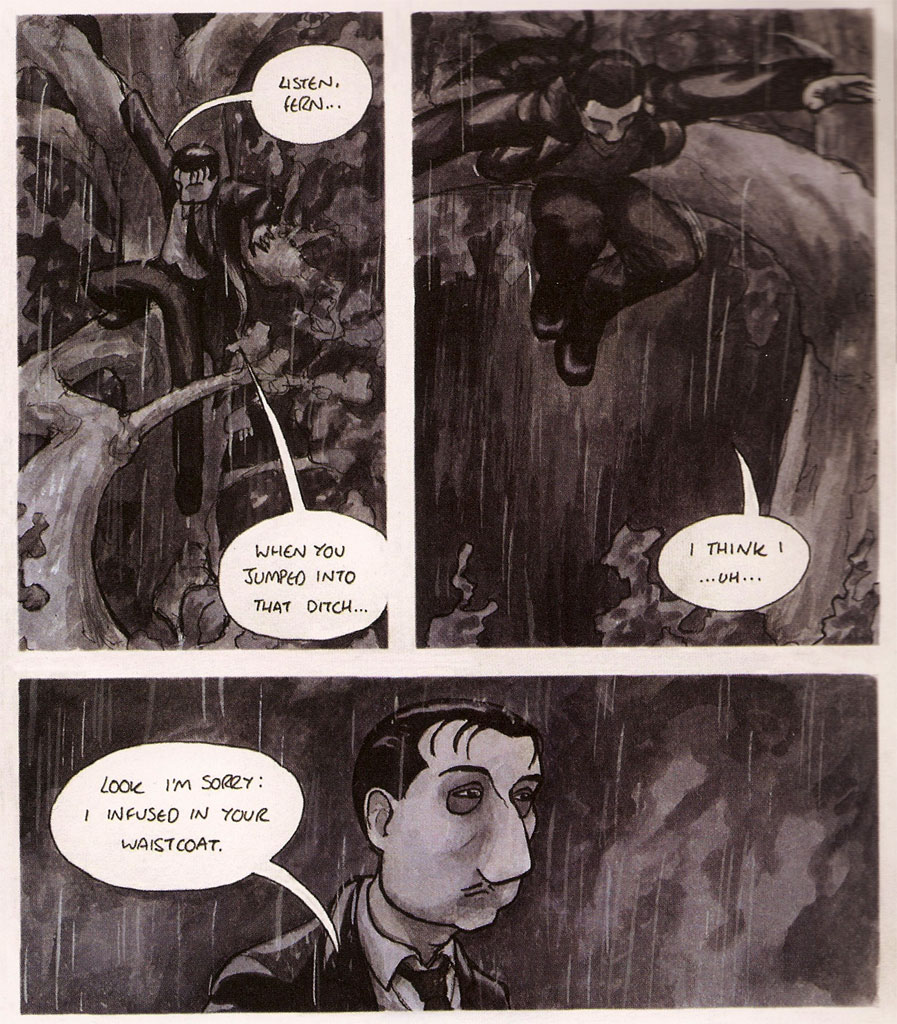
When I drew my swipe panel, I said there were a couple of things about the book that I didn't like. One of them is the lettering.

I know I was complaining about computer lettering yesterday, but this book is having sort of the opposite problem: hand lettering that isn't steady or legible, and draws attention to itself in an unfortunate way. Speech balloons appear in an untidy all-caps hand, and Britten's narration is in a script that is at times genuinely hard to read:

I don't mean this as an insult to Berry, but because I know the lettering has been bothering me, I want to take a look at it in detail, to figure out what about it isn't working. After all, I teach this sort of thing on occasion, and I want to be able to give good advice to my students. Have a look at this balloon, enlarged from the size at which it appears in the book, and see whether you spot any problems that I don't mention:

So: for starters:

I notice that the letterforms aren't very consistent. Look at the two versions of B that appear in this part of the balloon, or the two Ls.
A lot of the letters are made in a single loose stroke (with no strong angles) that tends to open up and lose its shape, like the B in BE or the N in BRITTEN.

There's not much consistency in the proportions of the letter parts. Look at the way the bulb of the R dominates the letter in REALLY, compared to the one in HEARD. Notice the way the proportions of the E shift, too.

A lot of the letters, as part of their basic form, contain a C-shaped swoop, so that when you pile a lot of Rs, Es, Cs, and Ss together, it's really sort of hard to distinguish one letter from another.
My first reaction to this lettering is that it's been done by someone who doesn't often write by hand, and who rarely prints in all caps when she's not lettering a comic. It doesn't feel as regular and natural as handwriting, and it's not as legible as it could be.
It also doesn't mesh well with the drawing in the comic, which is much more controlled and natural. Maybe that uneasy fit is partly a question of drawing medium: the images are in a fairly lush range of watercolors, and there's no lettering equivalent for that. Would the letters look better if they were in good dark ink, though? Blowing them up for this examination suggests that there was an interface problem between the tooth of the drawing surface (watercolor paper?) and the pen used for inking (a fiber-tip pen?), but I'm not expert enough to say for sure what's making the edges of the letters so fuzzy.
The other main thing that bothered me about Britten & Brülightly was the character design.

Most of the characters are all cheeks and nose, so their heads are dominated by features that don't move and aren't expressive. Most of their heads end right behind the ears, and their eyes are way above the vertical halfway point on the skull. Given the realism of their environments, I found these caricatured distortions distracting. Moreover, since most of the characters' heads had the same distortions, it was hard for me to tell the characters apart. In the climactic scene, I needed to be able to recognize both of the characters revealed in the bottom panel here:

... but I was honestly confused. Had I seen those noses before?
I didn't hear much about Britten & Brülightly when it came out, and I'm not sure what sort of critical reception it received. I don't mean to make it seem like I hated the book. In fact, there's a lot I like about it. But I can't help wondering what it would have been like with a more practiced lettering hand or a somewhat more practical sense of character design.

2 comments:
Very careful post, that, Kaiser; I especially took to heart your comment about the C-shaped swoop in her letterforms ("researcher" was asking for trouble!).
One other thing about her lettering which reminded me of an issue that bugs me maybe more than it should. Namely: while word balloons are almost always prose, rather than verse, let alone heavily end-stopped verse, I find that I dislike it when text is set in such a way as to produce jarring "enjambments" (or "carriage returns," as it were).
Maybe if the lines were wider within a word balloon, allowing for more text, I would be less bothered, but if, for example, there is a phrase like "find out," I vastly prefer for "out" to be on the same line as "find" (to take an example from one of the panels you posted). Maybe that's just me...
About that "enjambment" effect:
I noticed a panel in Maus the other day that didn't so much bother me as catch my attention. The top of the panel has two speech balloons, one of which reads:
YOU MUST BE
ARTIE. I'M MRS.
KARP. WE'RE
NEIGHBORS.
And the other reads:
YES. MY DAD MEN-
TIONED THAT YOU'VE
LOOKED AFTER HIM
WHILE MALA'S GONE.
Both the break (with a period) after "MRS." and the hyphenation of "MENTIONED" struck me as strange (and maybe suspect) decisions. Spiegelman's usually a very careful letterer. But I could also tell that he was straining to get the dialogue into a pretty small space.
Post a Comment