This week, Y is for yahoo. Not the search engine, of course, but the hominid beast imagined by Jonathan Swift in the fourth book of Gulliver's Travels.
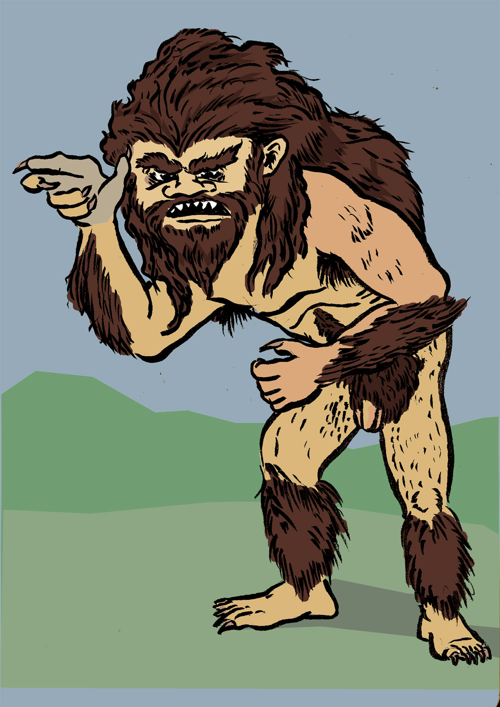
Oh, sure, with the way that the satire works, the Yahoos are just a mirror image of the reader, savage human beings. But I have no doubt that Gulliver would have felt no compunction about putting a Yahoo in a zoo. Thus: beast.
I'm not really happy with the way my finished version turned out, but I have a few "process" doodles to show you. One is the sketch I used to create my final image, and to tell you the truth I wish I'd been able to translate it a little better. I like the energy of this pose a lot more, and I don't understand why.

There's also a little doodle that's meant to show a slothful yahoo in repose. That, too, could have turned into an interesting finished version.

As an extra bonus, here's a classroom doodle that I did when I was studying Gulliver in grad school. This would have been in the spring of 1995, I think. It was a very doodly semester for me.

Apparently my idea of the yahoo hasn't changed much in 17 years.
Next week, for the big finale, I'm hoping to do a double entry in Alphabeasts, with a creature from the deep past of a well-loved franchise and a different creature from the distant reaches of our solar system.
Okay, it's 4:30. Time to get back to work.

3 comments:
Full frontal nudity! Alert the Safe Search filter!
I like the array of sketches here, Kaiser (esp. the 17-yr-old grad school sketch). And I have some thoughts about what makes your process sketch look more energetic than your finished drawing. To my eye, there are several factors, chief among them these:
1) The process sketch presents a face in 3/4 view; the finished drawing presents a face that looks more head-on.
2) The process sketch has a distinctly protruding ribcage over a distinctly recessed abdomen; the finished drawing evens them out with basically a straight line from armpit to waist.
3) What I think is most important, though, is this: the process sketch appears to show the yahoo's back looming up over its left arm, with the mats of its mane even higher atop the pile of the back. The whole creature looks larger and more looming as a result when compared with the finished drawing, where the coloring of the back hump as solid brown makes it look like mane only, not back. Thus the finished back reads as hair, not as powerful musculature, and the whole beast consequently looks scrawnier, like it's steeply (and uncomfortably) bending at the waist while keeping its back straight. The process sketch looks like a monstrous, large-backed creature that is curving around its abdominal core in expectation of swooping down on something.
4) Something else that I just noticed: the creature's right hand is lower in the finished drawing, such that the thumb is on a level with its eyes, almost as if it's shading its face; in the process drawing, by contrast, the hand is much higher and further from the face--the thumb is somewhere against its forehead--so the hand looks more like it's poised to strike out at something rather than shielding the yahoo itself.
That's how it all looks to my eye, at least. Let me add two more notes: First, I don't think the finished, colored drawing is at all bad, but I share your sense that the process drawing is more energetic (something I feel approximately 100% of the time with my own sketches vs. finished drawings), and for once I think I can identify some of the factors that might account for that. Second, it's surely easier for me to see such things in someone else's drawings: the results here remind me strongly of my attempt to redraw that Batman cover for the Covered blog, in which my version of the caped crusader looks static and stiff compared to Walt Simonson's original drawing (to which I am tempted to add: well, duh!).
First of all, I'm shocked, sir, SHOCKED by this Yahoo's brazen exposure! I must go fetch my fan & smelling salts.
As to the sketch to finish shift, I feel your pain-- it's the hardest thing in the world to keep the fresh energy of a sketch going in a tight rendering.
I do think your Yahoo vision is right on the mark, NSFW rating included!
You flatter me, Leah, by calling that rendering "tight." I think "sloppy" or "ill-considered" would be just as close to the truth.
Probably a lot of the sketch-to-finish problem could have been solved if I noticed some of the things that Mike noticed while my finished drawing was still in the pencil stages. Still, I've done crummier work than this for these alphabets. I am not too ashamed.
As for the "brazen exposure," that's a lot of what makes the yahoo so horrible (and so threatening) to Gulliver. It's even worse when a female yahoo surprises him during a bath, as I recall.
Mike, you are right on all fronts. Here's hoping you can use some of those drawering smarts in the Alphabooks project!
Post a Comment