
It's hard to capture the size and sublimity of Moby-Dick in a cartoon drawing on a computer screen (or in a book). In fact, I have an essay in my head somewhere about the difficulties of translating Moby-Dick into comics, and one of the insurmountable problems has to be the intimate scale of the images in a handheld comics page. Really Moby-Dick needs to be cartooned on the scale of Guernica or the Sistine Chapel ceiling.
Anyway, I thought one approach to the problem would be to show as little of the whale as possible. There's also a lot of talk about the blankness of his whiteness, and the way that people therefore project meaning onto it. I thought it'd be fun to make as much use as I could of the blankness of the computer screen, too.
You can tell me whether you think that's effective. I will acknowledge that I ripped off the composition, in part, from a painting that Scott McCloud brings up tangentially in Understanding Comics.

I once visited Arrowhead, Melville's home in the Berkshires, where I was told that, in the winter, from the window of his study, Mt. Greylock looked like a white whale. It seemed implausible to me. But I figure that if you have whales on your mind, over time almost anything will start to look like a whale.

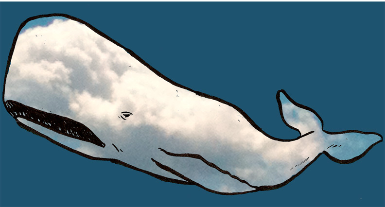
Like, for example, this cloud I spotted earlier this summer.
Maybe it'll help if I show you what I mean.

Is it just me? Have I started seeing whales?
(Really I think that cloud looks more like a bowhead whale than a sperm whale, but I swear that before I got my phone ready to take the picture it was a much better Moby-Dick likeness.)
You know Moby-Dick's not really supposed to be uniformly white, right? He's sort of marbled.
Next week: a married couple you wouldn't invite to a dinner party.

3 comments:
Both of these approaches are brilliant! They capture the elusiveness of the whale so perfectly...
I quite like the cloudy whale, and I think it looks most convincing when lifted out of its original context (with the trees) and allowed to swim by itself in computer blue.
I like the "Big N"-inspired concept of the close-up of Moby surging upwards (I assume the orientation is deliberate), but while the eye is appropriately menacing (or inscrutable), it doesn't feel quite massive enough for me. Maybe if I could see more *teeth* it would make a difference?
I'm also interested in your claim about the scale of the reproduction of the art and whether it's necessary to have a vast canvas for a visual depiction of Moby-Dick. There certainly are some comics out there that have been designed and printed for the impact of a large surface, so I think you'd have a shot at sublimity even without Guernica proportions; but then I think even a regular sized comic would have a chance of it if handled carefully enough. Imagine if Roy Crane had the art duties on a Moby-Dick adaptation! Or Krigstein, maybe?! I think even Feininger (also a painter) might have come up with some interesting results; anyone who can draw Mysterious Pete gunning down a typhoon would have a chance at the sublimity of the ocean waves. Check it out: http://cartoons.osu.edu/digital_albums/lyonelfeininger/9_16.html
https://hellotaw.blogspot.co.id/2011/04/the-beatles-mix-with-metallica.html
Post a Comment